Colour: A Kind of Bliss
Essay by Andy Parkinson
In 2017 the exhibition Colour: A Kind of Bliss brought together six British painters concerned with different approaches to the use of intense energy and luminous qualities of colour. Through varying densities of paint and chroma, saturation and de-saturation, their paintings realise direct emotive forms resulting in both subtly and vibrancy. Painting for these artists working in the field of abstraction/non-figuration is a synthesis of ideas, drawing and colour.
Colour can be indulgent. You can lose yourself in it, as in colour field painting. Viewing a gigantic Jules Olitski for example, such as Instant Loveland, (1968), undoubtedly induces a blissful state. The critic Peter Fuller was very wary of this experience. I remember being shocked, hearing him refer to this paintings as “awful”. Today, I still think it is a great painting. However, I can see that it may be in danger of eliciting a gormless fascination, a distraction from the “real world”, a bliss that smacks too much of escapism, an opiate.
When Roland Barthes refers to colour as “a kind of bliss”, i he is countering a first impression of Cy Twombly as an anti-colourist. To do so, Barthes differentiates colour “in the blissful sense of the word” from colour as a “rhetorical mode of existence”, a “sensual idea”. He contrast them along the following lines.
Colour as bliss
Lacerates something, passes in front of the eye, apparition, disappearance, like a closing eyelid, a tiny fainting spell. Appears, is there, inscribed.
Colour as sensual idea
Intense, violent, rich. Delicate, refined, rare. Thick-spread, crusty, fluid. Affirmation or installation of colour.
For Barthes blissful colour is almost incidental, as if the altered state that colour induces were akin to the naturally occurring trance states that we experience on an everyday basis, a daydream, an apparition, or a negative hallucination such as not being able to find the car keys, even though they are staring you in the face on the kitchen table. Disappearance, a closing eyelid or a tiny fainting spell has momentarily hidden them.
Colour as bliss cuts into our everyday “reality”. It is inscribed into it, rather than installing itself with cries of affirmation. Yet, neither is it exquisite nor exclusive. Instead, it is simply present if we are. However, it is the presence of something quite extraordinary, as David Batchelor has it, “a falling into a state of grace”.ii
The 18th century poet Thomas Gray had already associated colour with bliss in his poem Ode on the Pleasure Arising from Vicissitude, where “the hues of bliss more brightly glow chastised by sabler tints of woe”. Colour, appearing brighter when countered by black, becomes in the poem, a metaphor for the tempering of joy with grief, again suggesting a grounded bliss, somewhere between hedonistic pleasure and spiritual ecstasy.
Kandinsky no doubt overstated the case for colour in his treatise Concerning the Spiritual in Art, invoking its healing power after the fashion of chromotherapy, but the attempt was to ground the spiritual in the discoveries of “science” at the same time as showing that colour could affect the viewer directly, quite apart from the requirements of imitation or analogy. He was making a case as much for abstract or non-objective painting as for colour.
The artists in this exhibition approach colour directly, without the distractions of representation, but also without an over indulgent spirituality.
In the paintings here by Julian Brown, colour seems inherently tied to the ground upon which it is situated. In Vega (2016), spectrum bands zig zagging across the surface have been applied over a polished, pearl white surface that shines through the gestures lending them a vibrant luminosity. Scattered among the assertive bands of colour are black circles, dots that look to have been dropped or splattered into existence, except that they also look too carefully placed to have been made that
way. A non-verbal conversation takes place between the ground, the rainbow bands and the black dots, as well as between each band, some favouring the yellows and oranges of the spectrum and others more the blues and violets, each band shot through with lines of other temperatures.
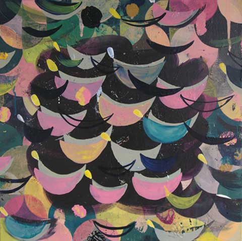
In Tattoo Lagoon, (2017), the sabler tints of dark blue and grey form circular patterns in the centre, flanked and partially obscured by multiple crescents of various colours, resembling melon boats on a sea that is just about to become stormy. They are accompanied by circles in gold, amber, maroon, black and silver along with tiny yellow speech balloons, ochre asterisks, pink drips and blue or green runs. And all the time it’s the dark ground that calls to us, almost menacingly. A captivating darkness is waiting to envelope us, just as it has already overtaken some of the crescent shapes, absorbing their colour into a homogenous mass of dark.
Yet it is a playful and joyous painting, the darkness recalling the dark ground of East Asian decorative lacquerware or indeed the Polish folk art that Brown cites as an influence.
In David Manley’s shield-like ovals painted on aluminium, colour differentiates one form from another, or merges geometric shapes so that they come in and out of view often giving way to a larger pattern of their interconnections, like cut-outs in paper, where the paper is kept and what’s cut out is thrown away, as if to bring our attention to the importance not so much of things as the relationships between things.
In his Nine Lives of Fives, (2017), pentagon forms are all but destroyed by having been posited, erased and restated numerous times and in many places within the frame. Colour gives them life via demarcation, just as it does for map-makers who have known for centuries what I only just learned from Beau Lotto that “you only need four colours to create any map and be able to make sure no bordering countries are ever coloured the same”.iii
In my own paintings, I am interested in what 17th century cartographers knew about colour, that colour spreads, not “really” i.e. physically, but “really” i.e. in our perception. It is unnecessary to colour-in every country of a map, the colour of a bounded outline can be made to spread into an area, not physically, but perceptually. Visual cognition scientists have called this the watercolour effect (WCE). A light meter will show you that the area is physically white, but colour is perceived there as a result of the boundary colour. In my Cybernetic Drawing (Hexagons), (2014), the pink of the drawn lines merges into the white of the ground in a similar way.
In, Jeff Dellow’s paintings the same motifs change dramatically in different colour-environments. A motif seen in one painting looks very different when set within the differently coloured ground of another. Also, within a single painting, a repeated motif, especially the net-like motif that appears quite often, looks markedy different depending on its colour. But even more interesting, the ground that I know is the same colour over a large area, changes colour where different coloured nets interact with it. In Orange Fix, (2016), the orange ground between and around the squares of the green/grey net motif is much redder than it is between the squares of the lilac/greys along the right hand edge. The ground is the same colour physically but perceptually it changes. Although we “know” that such “illusions” will take place, when they do, they surprise us. I think that is what makes colour so blissfully enjoyable.
The paintings of Freya Purdue are like colour landscapes, it is difficult not to read the blue grounds as skies, within which are colour happenings, resembling what daylight fireworks might look like, bursts of colour sometimes taking up discrete areas here and there and sometimes filling half the space.
Purdue’s Nada (2016), may be a picture of nothing. The sky association remains and there is a cloud- like shape, taking up more than half of the canvas. It could be a swarm of smaller nothings, insects perhaps, or atoms, or smoke. And this indistinct cloud hovers above sticks of colour that are arranged to suggest a perspectival recession into a vanishing point at the centre of a low horizon line. Associations abound, as they do whenever we see colours, but without ever cohering into a definitive object or idea or story. No thing is clearly depicted.
Lucy Cox’s playful geometric arrangements, almost inhabiting a believable three dimensional space, seem to celebrate the ways in which colour creates spatial ambiguities and irregularities. In Zippy Seven, (2017), holes in grey planar structures reveal coloured and/or patterned surfaces way behind them. However, being more coloured than the sable structures, the parts of surfaces covered by holes appear to push forward, sometimes occupying the space immediately behind a hole, but more often transforming themselves into positive circles that hover in front of the grey planes.
Knowing a bit of colour theory we could have predicted this chromatic (mis)behaviour. Nevertheless, when it happens we experience a jolt of surprise as if it had been totally unpredictable.
The trouble with colour theory is that it cons us into thinking we understand colour. Yet face to face with it, we find that we cannot get wise to it, almost as if it puts us in the wrong and makes us ignorant. But isn’t ignorance also bliss? Borrowing even more famous lines from Thomas Gray: “where ignorance is bliss, ‘tis folly to be wise”.iv
Andy Parkinson, 2017
i. Roland Barthes, The Responsibility of Forms, Basil Blackwell, 1986
ii. David Batchelor, Chromophobia, Reaktion Books, 2000
iii. Beau Lotto, Deviate, The Science of Seeing Differently, Weidenfeld & Nicholson, 2017 iv Thomas Gray, Ode on a Distant Prospect of Eton College, 1747