Gordon Dalton: Artist of the Month
Artist of the Month March 2021: Gordon Dalton, selected and interviewed by Paul Newman for CBP.
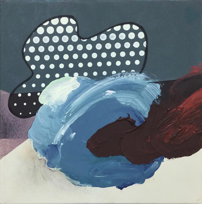
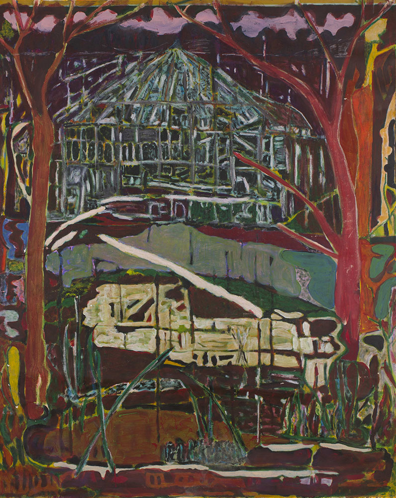
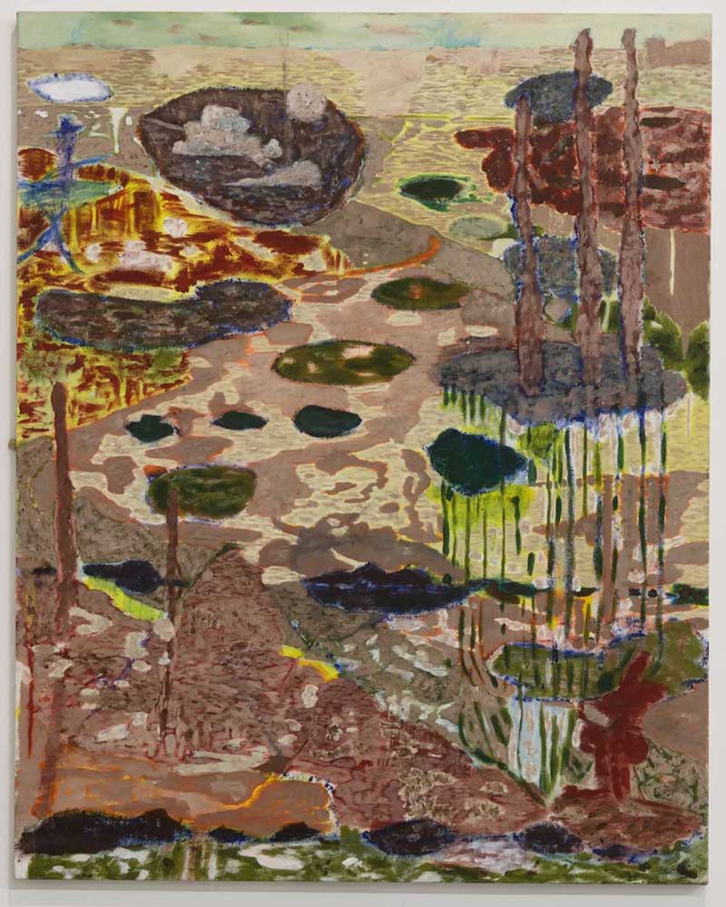
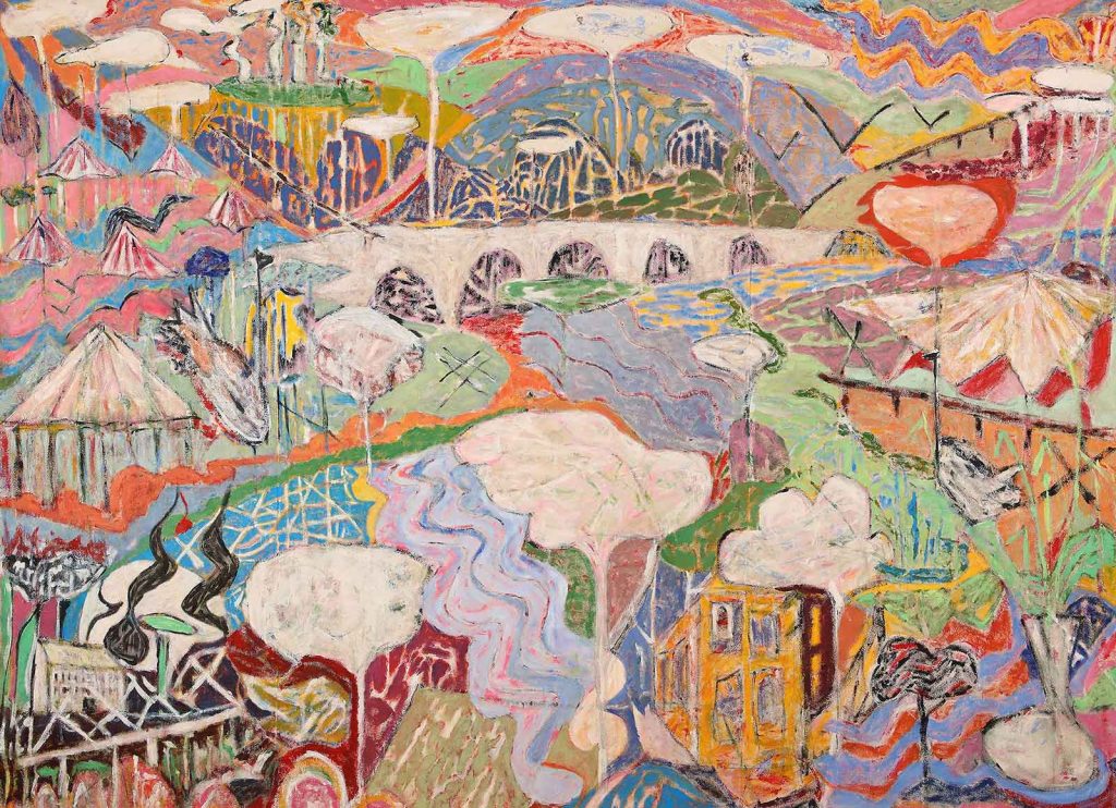
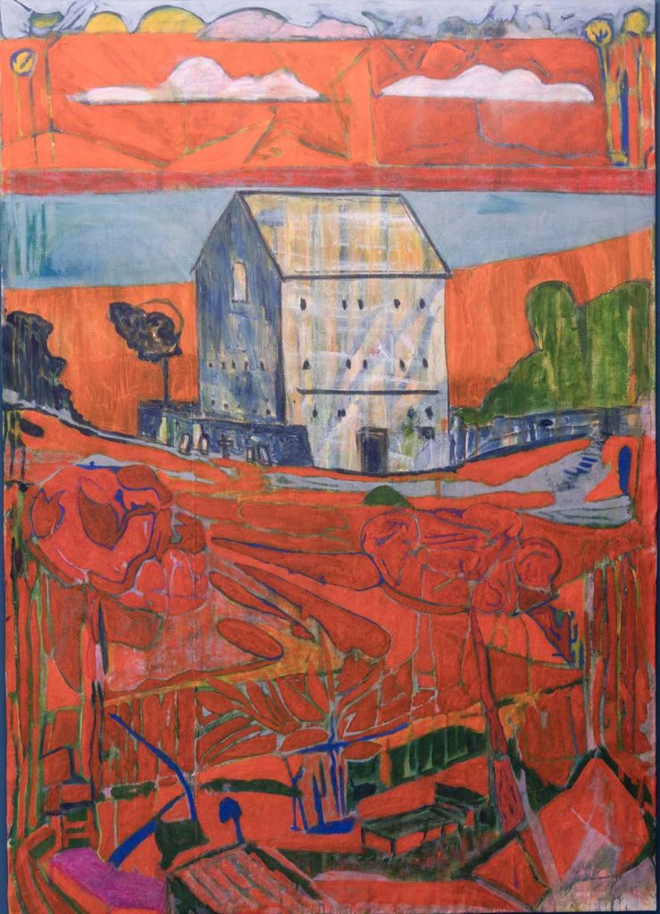
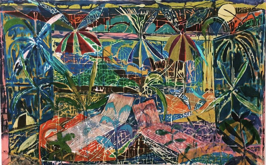
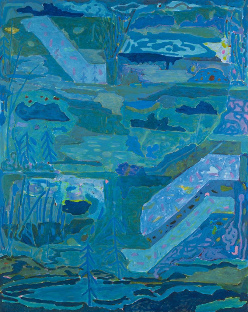
Dead Reckoning is the process of calculating your direction by using a previously determined position. It is thought that Dutch sailors threw dead bodies overboard to calculate their future route. This seemed apt for a solo show in my 50th year in 2020. It’s not about looking back, it’s about looking forward. Some hope among the cynicism. I’m trying to make the viewer look longer and harder, to have a one-on-one relationship with landscape painting; to make them curious and find some joy. The places depicted in my work are partly an invention, full of contrasts and spontaneity. They combine memories of places I have lived or longingly imagined, an idea of a place and the melancholy of longing and wanting to belong. An unfashionable romanticism grounded in the act of painting.
Gordon Dalton 2020 ‘Dead Reckoning’ The Auxiliary Warehouse, Middlesbrough
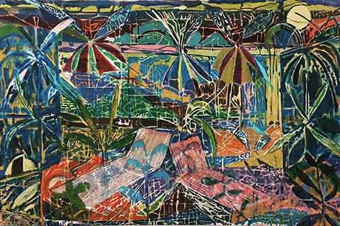
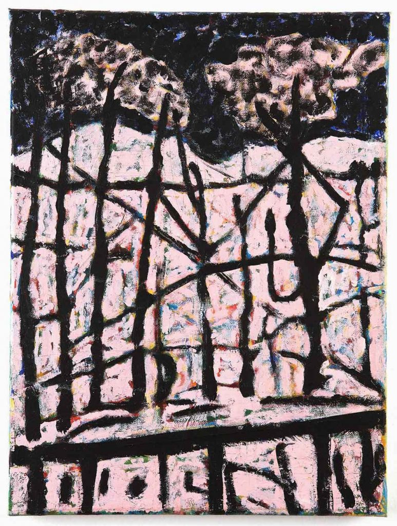
CBP: These are landscape paintings, though often portrait in format, with motifs such as cloud shapes, organic shapes, occasionally, industrial motifs like concrete blocks, or leisure motifs like deck chairs. They appear like landscapes conjured through imagination and improvisation. Can you discuss the notion of landscape in your paintings?
Gordon Dalton: They start with places that I have lived, visited or longingly imagined. The motifs are a kind of shorthand or wonky grammar, trying to hold together a lot of improvisation, coincidence, chance and mistakes. The portrait aspect adds some tension or awkwardness, as well a way of hopefully making the viewer try to find their way through the various perspectives.
CBP: Your painting evokes the aesthetic of an actual landscape in the busy complication of imagery, like looking out of a window across staggered horizons cluttered with shapes and forms. It’s an aspect that evokes the appearance of a tapestry. Can you discuss this sensibility of packing in as much information as you can, layering your painting with all over detail?
GD: I like the idea of them being tapestries, it’s something I’ve played about with a bit, where you have lots of various view points, or panoramas. They are mostly painted unstretched so I can shift them about easily, but I’ve also shown them this way to give the idea of a tapestry. I’m a big fan of Japanese woodblock prints which have a similar effect, lots of distance but flattened out. I’d love to get one of them made as an actual tapestry.
I spend a lot of time fishing, where you have multiple horizons right in front of you, from the edge of the lake in front of you, the near margins, the ripples in the water, various water features such as islands or reed beds, then the far margins, the edge of the lake, fences, bridges, tree lines, then the distant hills, clouds etc. I guess all this seeps in and out of the paintings, and hey, we’ve all spent a lot of time looking out of windows longingly.
CBP: The division seems an integral pictorial strategy, dividing up the composition, and an importance often seems to be placed on stuff happening on the edges and in the margins, for example ‘Bird House Blues.’ You almost find miniature paintings within the paintings. An artist like Richard Diebenkorn comes to mind for this aspect alone. Can you discuss the creation of divisions and line in your paintings?
GD: I often put that down to growing up on a cliff with a huge horizon on the North Sea. There’s various vantage points within the paintings, sometimes its like you are looking down into something, looking up to the sky or you’ve just popped your head into a room. Some of the horizons begin at one side the suddenly stop, sometimes finishing in another part of the painting. With the addition of lots of verticals from things like trees or paint drips, there’s a sense of a grid, but its all rather jumbled.
Details are picked out or hidden away, only to be found later on when you recognise a shape or colour elsewhere.
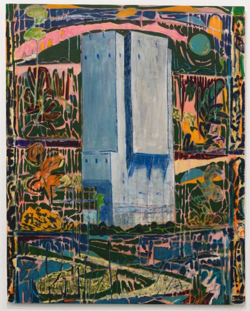
CBP: Your paintings are very colourful; and an old cliche in art critique compares Mediterranean colour sensibilities in European painting with muted, tonal colour schemes found in Modern British landscape painting and British artists who strove to break free of that. There is a sense of affirmation unbounded and pleasure in your painting in the way you use colour- though still with dark undertones. Can give a few thoughts on your use of colour. Has it shifted over the years?
GD: It has, partly through confidence, partly through chance. The work used to be quite dark tonally, almost as if I wasn’t confident enough. The colours were always there trying to get out. There’s a lot of underpainting in some places. I generally work everything out on the canvas, there’s no preliminary sketches. There’s a lot of vivid pinks and yellows sketching out things or blocking areas, then working into them, or not.
Sometimes they are complete contrasts or trying to divert your attention, to put you off. Other parts can be total cliché or coincidence. It has to sit together as a whole. Paintings such I Thought I’d Take A Final Walk play with that British sensibility. They look green, but it’s a riot of colour underneath. Also, if I’m thinking of Argentina, or Ibiza, then that throws different ideas. Sometimes you turn it on its head, others you paint it how it is, or attempt to.
CBP: As an artist myself painting in acrylic, I’ve occasionally been challenged as to why I don’t use oils. Can you talk about your use of it as your primary medium? Is it a medium totally natural and habitual to you?
GD: I’ve never been a technical painter as such, and oil paints seemed to me to be about some kind of finesse, which isn’t my strong point. Acrylics were more immediate and I could mess about with them much more, pollute and abuse them in some way. On a more practical note, they were cheaper.
Available via Aleph Contemporary.
CBP: Your titles are personal, poetic and feel like they describe the drift of thought in tune with your painting process, or a sense release (and relief) assigning a title in the moment after you feel its done. Can you talk about your strategy of titling?
GD: Yes that’s a good way of putting it. Sometimes they are a clue to a place or a mood, or something to throw you off the scent. Sometimes they are lyrics, sometimes things overheard on the bus, little snippets of conversation out of context. They can give some narrative thread but you never find out the rest of the story, so you are a little bit lost. There’s a sense of melancholy in them, wandering around lost in a painting.
I used to have lists of titles in notebooks waiting for a painting to come along.
CBP: How long do your paintings take generally? Have you ever exhibited a painting then gone back, reworked it and exhibited again, perhaps with a new title?
I logged the hours on some paintings last year, putting up works in progress alongside how long it had taken so far. It was useful to see where and when a painting might have taken a right or wrong turn.
The larger paintings averaged about 60 hours, but to be honest they can take 6 hrs, 6 months or 6 years. I’ve gone back to things after they have been exhibited, changed them completely, which is frustrating when someone wants to buy it how it was. There’s some paintings that sit in the studio for years, waiting for their moment in the sun.
If I can get a couple of solid days on the bounce then things tick over, but it can be stop/start.
CBP: What’s your current studio routine? Has it been affected over the past year due to Covid?
GD: Pretty random during this lockdown. Home schooling is a curse. I’m currently only getting there once a week, or a couple of nights. I lost a studio last year, but then had an amazing studio on the seafront during the summer for just 40 days. It was so productive, completing 4 new paintings compared to not finishing anything in 2021.
CBP: Any up-and-coming projects you would like to discuss? You have a new catalogue of your work recently published too for your solo retrospective ‘Dead Reckoning’.
GD: Yes, the catalogue rounds up work from 2015-2020 and my solo show last year at the Auxiliary in Middlesbrough. I’ve been overwhelmed that it sold out its first edition. There’s finally a new website that puts everything in one place. I’ve also been making work for the amazing #artistsupportpledge, initiated by Matthew Burrows. There’s some rescheduled group shows to do and I’m in the Plymouth Contemporary Open 2021. I’m in the process of making Northern Valhalla, a film with S Mark Gubb so that’s keeping me occupied.
And I’m just hoping to retreat to the studio and crack on with some new work.
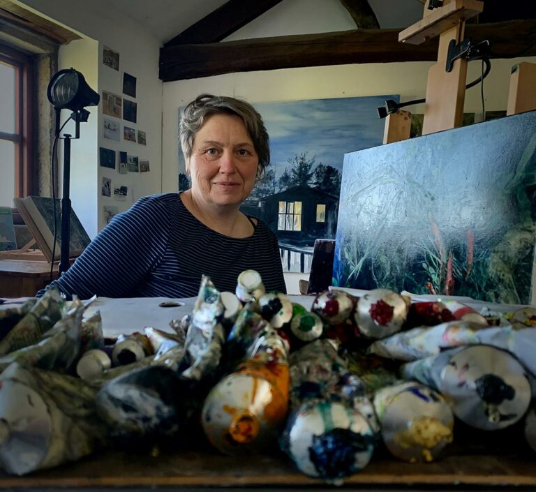
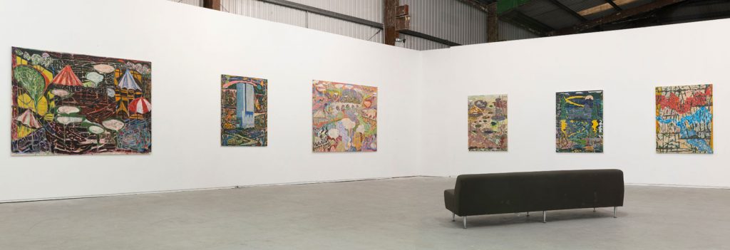
Gordon Dalton is an artist based in Saltburn, UK. He recently completed an URRA residency in Argentina, with recent shows including Royal Academy, London; Bank Art; Los Angeles; Del Infinito, Buenos Aires; JirSandel, Copenhagen; Keith Talent Gallery, London; Newlyn Art Gallery & Exchange, Penzance; CAC, Vilnius; David Risley Gallery, Copenhagen; Cynthia Broan Gallery, New York; Moravian Gallery & Museum, Brno; Castlefield Gallery, Manchester; Trade Gallery, Nottingham; Conversations in Painting, Darlington; Mission Gallery, Swansea, Contemporary British Painting Prize, Richmond; Beep Painting Prize, Swansea. 50 Years of Painting from the Tees Valley, Auxiliary, Middlesbrough; Terrace Gallery, London; He curated Mountain Size: Contemporary British Painters, Pineapple Black, Middlesbrough. His solo retrospective Dead Reckoning at The Auxiliary, Middlesbrough.
Gordon Dalton is represented by Aleph Contemporary.