Deb Covell: Artist of the Month
Artist of the Month April 2022:
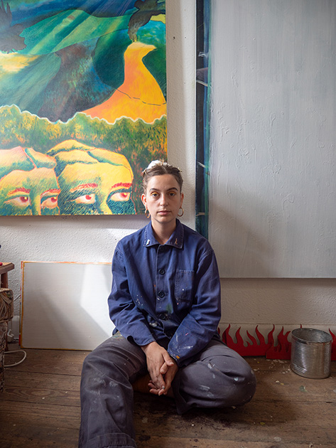
Deb Covell, selected and interviewed by Paul Newman for CBP.
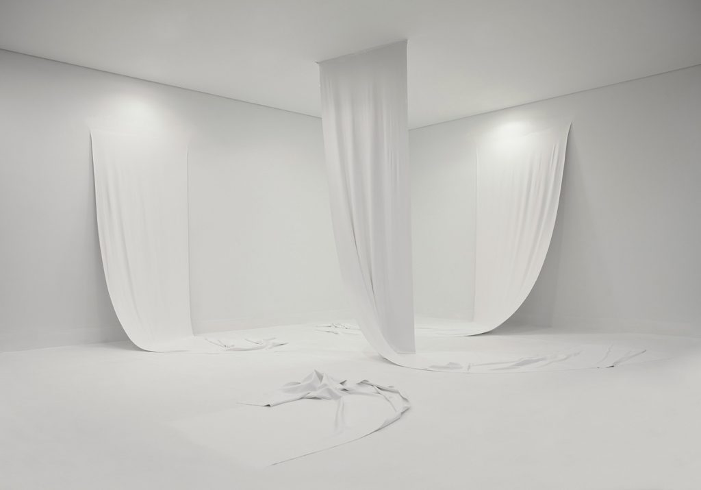
Deb Covell’s practice is concerned with bringing a form into being by exploring the material and sculptural potential of paint. She has omitted a traditional fixed support of a canvas and instead paints layers of acrylic paint onto plastic sheets which are then peeled off to create a paint support or ‘skin’. She then goes onto fold, crease, cut and collapse these paint supports thinking about gravity, weight, shape, surface and colour and lets the natural behaviour of the paint take precedent until new three dimensional forms emerge.
CBP: Your most recent works in progress appear based on flags; The Ukrainian Flag, the English and Scottish flags and a red triangle on a blue ground provocatively titled, Tipping Point (Red Dagger). Is this a more conscious decision to load specific political and connotation along with the objectness and pure form of these motifs?
DC: You’re right – my work at the moment has quite consciously turned to matters of political and climatical urgency and several exhibition opportunities have come up that have given me the chance to explore these ideas. However, these political ideas aren’t new in my work – for example I responded to a show about the Bauhaus’s 100th anniversary I took part in called Century at drj art projects in Berlin (2018) by making a series of works called ‘New Union’ – referencing the Union Jack. In the works I replaced Red, White and Blue with the modernist colour palette of Blue, Red and Yellow in an act of solidarity to our European neighbours after the Brexit debacle.
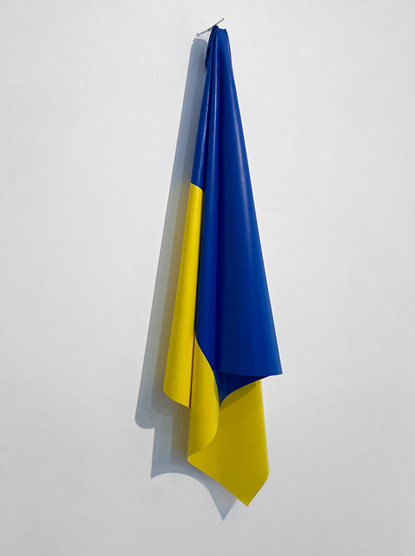
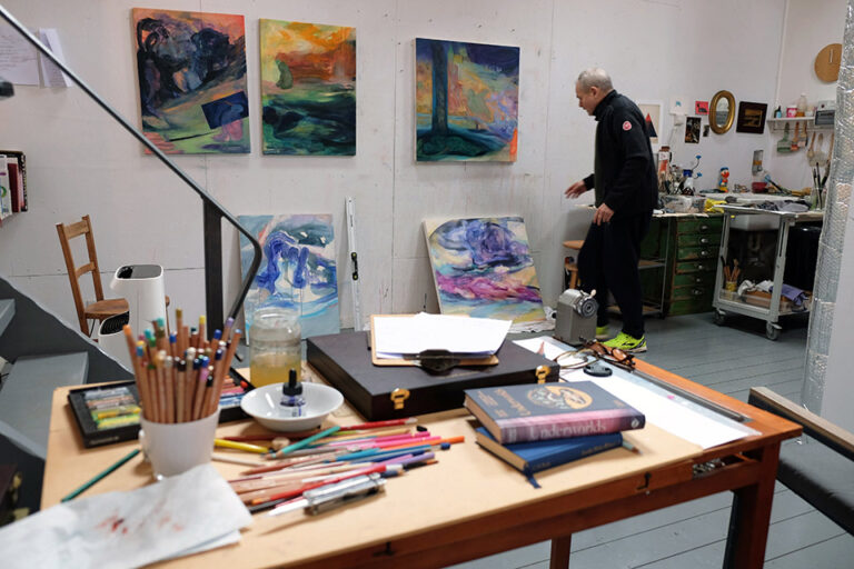
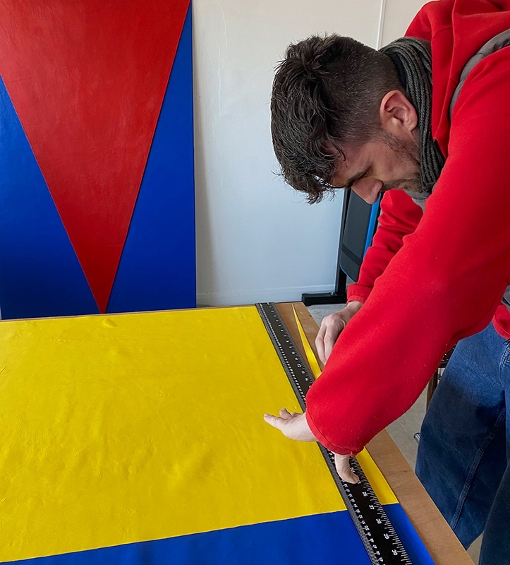
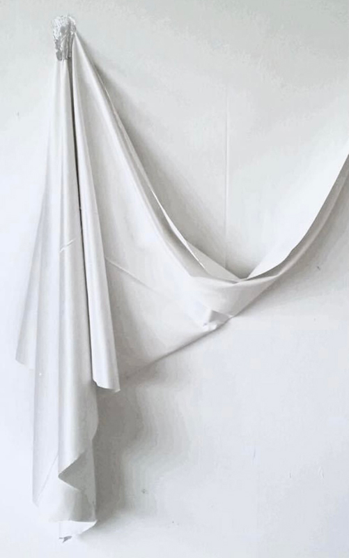
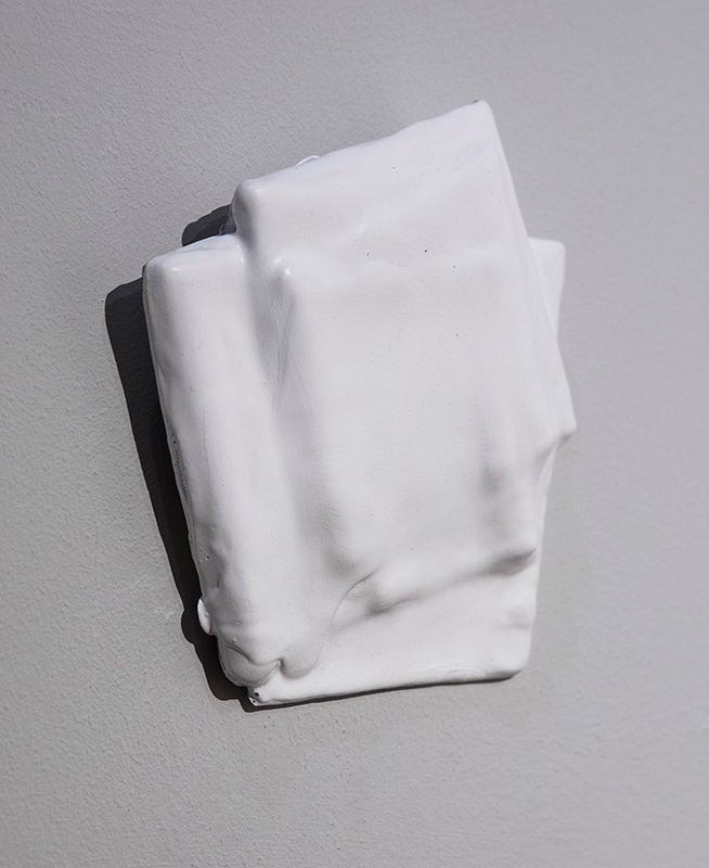
Hope and Glory, acrylic paint skin, 102 x 25cm, 2022 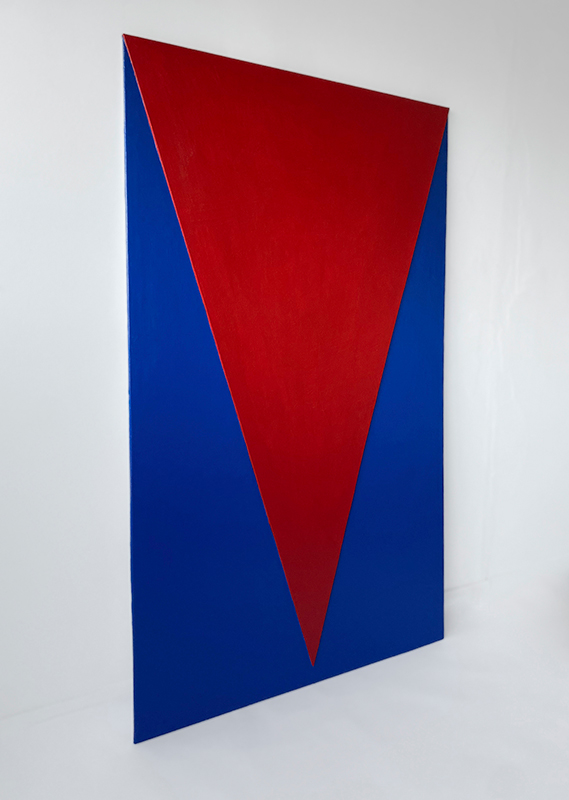
Tipping Point (Red-Dagger), acrylic paint skin mounted on polymeric support, 100 x 166cm, 2022
Very recently I was invited to take part in a survey show of Northeast Painters by Narbi Price called ‘Everybody Knows This is Nowhere’ – Painting in the North East Now at Newcastle Contemporary Art. I decided that this was a good chance to make some provocative works using the flag motif again and its relationship to cultural and personal identity. The two flag pieces I made for the show entitled ‘Hope and Glory’ and ‘Sad Flag’ were based on the yellow and blue Ukrainian flag and the other one was loosely based on the Union Jack. I wanted these two pieces to riff off each other and speak about the changeable, non-fixed relationship to identity and pride we can have in our homeland. In a kind of perverse twist, the name of the piece which refers to the Ukrainian flag adopts the pomp and ceremony title of ‘Hope and Glory’ which has always been associated with the British Patriotic song ‘Land of Hope and Glory’ whilst the ‘Union Jack’ has been relegated to the title ‘Sad Flag’ as I feel no particular honour or allegiance to it – particularly under this current Tory Government.
Work in progress 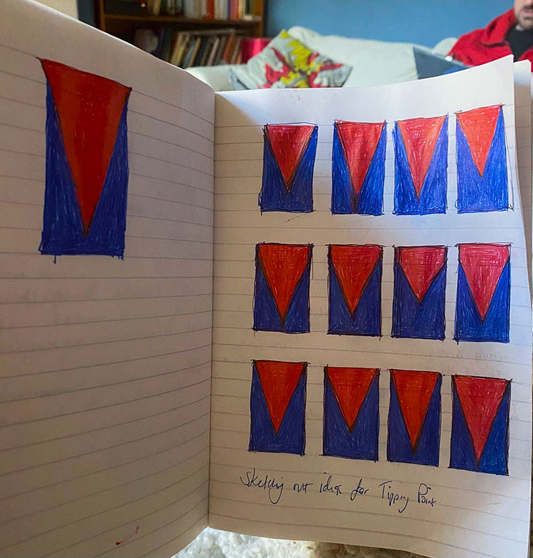
WIP sketches for Tipping Point, 2022
The ‘Tipping Point’ (Red Dagger) piece – also on display in the aforementioned show has a dual meaning for me – the current climate catastrophe (blue background symbolising the earth) and the red triangle (Red Dagger) symbolising the heated destruction of our planet as well as Russia’s illegal and horrific invasion of the Ukraine. The red triangle I used was a nod to El Lissitzkys’s poster ‘Beat the Whites with the Red Wedge’ (1919). In the poster, the intrusive red wedge symbolises the Bolsheviks, who are penetrating their opponents, the White Army, during the Russian Civil War.
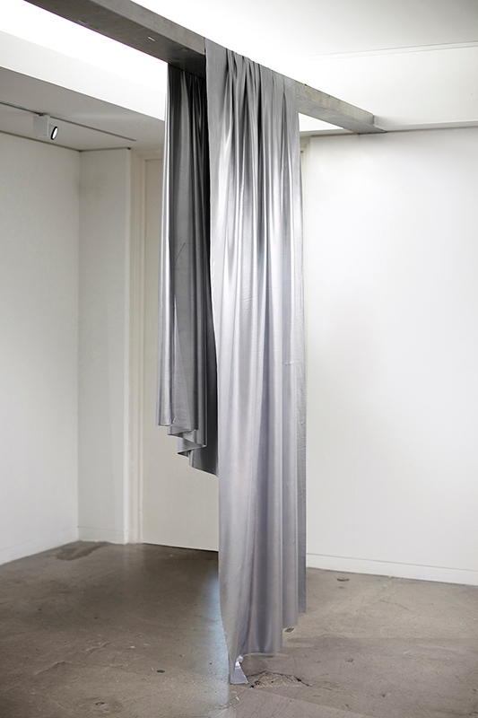
CBP: You are widely known for your sculptural paintings often presenting form like folds and drapery. The previous artist of the month Alex Hanna also paints studio set ups of folds and drapery, and he discussed the objectness of these forms as well the reference to drapery depicted in art history for example in Renaissance Painting. Your painting Silver Drape 2016 evokes a shower curtain, which suggests the sphere of influence includes a sculptural observation of objects in domestic spaces. Alex also paints radiators, so there might be some cross over as well as differences. Can you discuss the recreation of drapery and folded form in your work?
DC: Thank you pointing out the crossovers with my work and Alex’s wonderful, sensual paintings. Alex and I plan to work together some time in the future to explore some of these similarities as well as perhaps the contradictory nature of the 2D/3D forms that our respective painting practices can adopt.
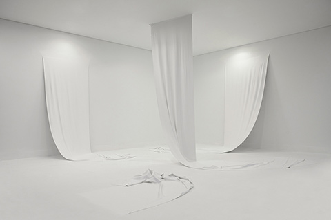
For some time, I’ve been looking for relevant ways of bringing classical drapery into my work that is meaningful and relevant to me. Before I made my all white, paint sheet Installation ‘From Nowt to Summat’ at Middlesbrough Institute of Modern Art (Mima) in 2016, I pondered on what direction to take some new large paint sheets that had been emerging from the walls of my studio (without a canvas support) for quite a few months. I decided to focus on the fact that the work literally grew out from the walls and were made from nothing but the paint itself. I was enchanted by the idea of poiesis (bringing something into being that didn’t exist before) rather than any historical connotations the work might suggest. However, recently I came across the beautiful Joy Division album ‘Closer’ designed by Peter Saville which inspired me to think I could make the white drapery I was producing both classical looking and relevant by potentially bringing it to life in a way that resonated with me. The album cover depicts the beautiful Appiani family tomb sculpture ‘The Lamentation of Christ’ (1910) in the Cimitero Monumentale di Staglieno in Italy, The cemetery was built after the cholera plague in Italy by Napoleon, and I drew comparisons on how it related to the covid pandemic – particularly this sculpture of family and friends gathered in mourning around the dead Christ. I’m still to explore this idea fully when the right situation and time arises.
The quotidian or domestic – as you mention is another element that finds its way into my work. Often my eye catches towels limply hanging on radiators, clothing on a washing line blowing in the wind – tightly pegged at the corners or bed sheets strewn over balconies, etc. To me this says something of the beauty in everyday life, that surrounds us all the time but is somehow overlooked or often passed by.
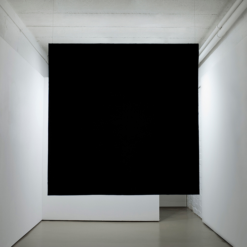
CBP: You make paintings as objects, layers of acrylic paint peeled off a support and reconstructed into a different form. Some of these are presented back on the wall and others are hung across the space like ‘Silver Drape’ and ‘Present’ a Malevich type black rectangle suspended in the middle of the gallery. Can you talk about your own strategies of coming off the rectangular painting support, as both a process led drive and discovery and as a dialogue with modern art history?
DC: The paintings as objects thing entered my thinking many years ago and was rooted in my desire to jump off making image-based work – which I had started to see as unsatisfying or pseudo in many ways. I guess it was an attempt to somehow seek out truth and realism in my practice – focusing on the materials themselves and the conditions the works existed in. I remember Robert Ryman with his beautiful ‘factual’ paintings being a major influence on me at the time as was Frank Stella with his famous quote; “What you see what you see.”
It was a slow process and I spent time experimenting in the studio and reading / researching philosophers and art historians such as Immanuel Kant, Martin Heidegger, Edmund Husserl, Rudolf Arheim and Merleau-Ponty. I think a key turning point came when I started using studio debris to make small collages from the waste materials of the large wooden panels I was making at the time. There was this hands-on direct handling of materials – picking up and putting ‘stuff’ together that I loved.
Alongside making the collages I was obliterating noisy painterly marks that were being built up on the panels that referenced my busy life bringing up two small boys and being a bit overwhelmed by the chaos at times. I’d tidy the lads’ toys away at the end of the day – leaving a blank tidy space in the room that somehow soothed me. These blank spaces found their way into my work as I obliterated the noisy marks with blank areas of white thick paint. Actually, I remember reading that Malevich had wanted to ‘free art from the dead weight of the real world’. This struck a chord with me and soon the built-up layers of white paint became a 3D relief that I saw as an important component of the work. These protruding paint reliefs Ied onto works like ‘Blanket’ – an all-white painting divided in two by a real recessed space in the middle of the painting created by the heavy layers of paint built up in the top and bottom sections of the work. I particularly loved the way the painting changed with different light conditions etc. – and the work entered the Mima collection a few years later.
Making acrylic paint skins were a natural extension to this process and letting paint be ‘itself’ without the restriction of a pre-determined scale, size, surface or edge that a traditional support has. I wanted to create my own paint supports from scratch, unhindered like a tabula rasa and free the paint from any ‘given’ situation which I had seen as a restrictive burden for me.
CBP: Artists like Angela de Cruz appear to take paintings off a support and half form them into another object. You appear to take this approach further, by spray painting or repainting your folded skins of paint. It heightens the seductiveness of the surface and solidifies the form further, appearing like a cast. It also suggests that the process is open ended, that it doesn’t finish with sculptural reconstructing after applying paint to a surface, that the ‘painting’ process can begin again. Can you talk about this process of reapplying paint to the skin of paint and in relation to the haptic surface qualities of the work?
DC: I love how artists like Angela de la Cruz, Alexis Harding and Steve Parrino have all stripped or sometimes tore the canvas off the stretcher or let the paint slip off and escape its support as Alexis’s work often does. There was something about these almost brutal acts of defiance and liberation or freeing of the painting from its support that spoke volumes to me when I was trying to figure out whether there was any significance to me making paint skins without a traditional support or stretcher in sight.
I remember having a feeling that freeing the paint from any kind of support and letting it stand alone was a significant moment in my work and it’s something I haven’t let go of – kind of defines who I am as an artist and keeps me anchored in the painting genre – which I’m happy about. From being used as a flat paint support to house my geometric compositions or shaped into various 3D forms that break into the space – it’s an amazingly versatile material that keeps on giving.
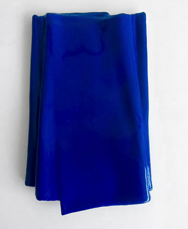
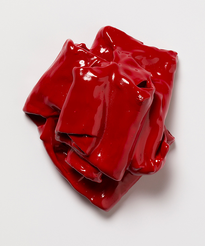
In the early days I used good quality acrylic paint to make the skins and the same colour ran throughout the skin. This was fine on a small scale but as the work grew bigger, I decided to switch to a particular acrylic paint that I could buy in large quantities but only came in white and therefore needed to be re-painted or sprayed with lacquer on occasion. The lacquered pieces do make the paint skin more robust and very sensual or seductive as you pointed out. Some of these surfaces or coatings (especially the crimson ones) suggested bodily subjects and I was happy to let these ideas seep into my work.
The open-ended nature of the skins mean they can be used again and are often resurrected into another form. One example of this is the rolled-up paint sheets from my paint installation ‘From Nowt to Summat’ became the material to make my ‘Red Flux’ series. I love this transformational aspect of the material.
Fade Away and Radiate, Alkyd paint on acrylic paint support, 2019 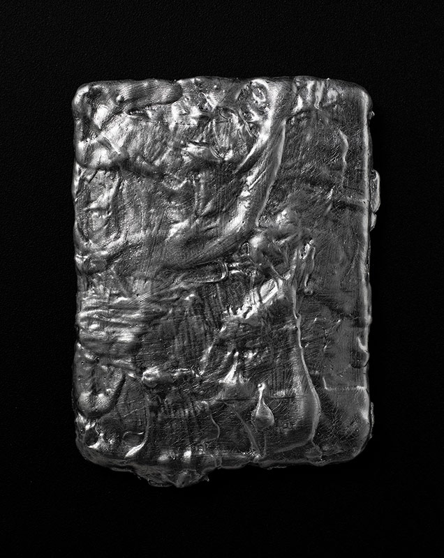
Forever in our thoughts, silver leaf and black gesso on acrylic paint support, 17 x 23cm, 2020
CBP: I notice on your Instagram page a sketch book page for the painting ‘Tipping Point.’ Can you discuss how you work from drawings and other types of preparatory studies?
DC: I don’t normally do preparatory studies for paintings – I usually arrive at finished work through a particular systematic and intuitive process, but on this occasion the shape of the triangle or wedge came to mind quite early on. I’ve explored diagonal shapes within my work for many years – it’s a dynamic, activating component and its introduction into any art work can unsettle the piece. As I mentioned earlier El Lissitsky used a red triangle (or wedge) in his piece ‘Beat the Whites with the Red Wedge’ to great effect and I was fascinated how this contentious shape even led to an argument between Theo van Doseburg and Piet Mondrian, the founders of De Stijl, which resulted in them parting company.
I had intended the work to grow out of a collage process using prepared paint skins, but time ran out and I reverted to drawing with coloured ball point pens to explore the right ratio of blue to red and to find the right gap – from the tip of the triangle to the bottom of the painting. I was after the right kind of tense energy in that gap and making the drawings helped me find it.
Red Heart, acrylic paint support coated in Alkyd paint, 18 x 16cm, 2021 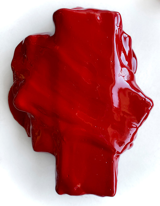
Eucharist, Alkyd paint on acrylic paint support, 15 x 20cm, 2022
CBP: Your painting ‘Red Heart’ is featured in the current Contemporary British painting exhibition ‘Paradoxes’ at the Quay Arts Centre on the Isle of White. It looks like a fresh, glistening bloody heart. Was it titled because of its appearance, or were you aware of the form whilst you were making it, or with a particular idea in mind
DC: The ‘Red Heart’ piece is part of an ongoing series of small works I’m doing called the ‘Heart’ series. I started making them in the middle of the covid outbreak which were intended to be given as gifts to loved ones that perhaps couldn’t be with us in those days of distance and separation. I loved the idea that the Hearts are so small that they can be held in your hand like a small warm bird or a precious stone that passes on a visceral sensation in the absence of a loved one. The origins of the idea came from one of my small pieces of red folded works that reminded me of a heart when I made it in 2018. A lovely gent wanted to give it to his wife as a birthday present so I called it ‘Love Heart’ and she adored it. I was taken with the whole idea of this beautiful exchange and I love working on these pieces knowing they will find a home with the right person.
These works start with a long tapered piece of paint skin and are folded into a tight pleat then released as I let go of them to find their own form. Some of the works using this process suggest other organs or parts of the body and I’d separate them and give them a different title, but the piece you mention here looked and felt like a Heart the moment it was complete.
CBP: What projects are you working towards at the moment and in the future?
DC: I am working towards some upcoming exhibitions and curatorial projects as well as on a book about my practice spanning twenty years which will be finished by July.
I am currently co-curating a show with Saturation Point Projects called ‘White Circle’ which will be shown at Saturation Point Projects in London in May. The show brings together a large group of contemporary international artists working in the non-objective genre today with the aim of connecting and uniting all the ‘White Circle’ artists in a show of Solidarity and Support for our friends in the Ukraine who are having to endure unbelievable hardships because of the illegal Russian invasion of their country.
I am delighted to be in a show called ‘An Expanding Field’ at Gloam Gallery, Sheffield in June. The exhibition celebrates The Expanded field of Painting and is curated by Stu Burke.
I am honoured to be invited to show my work alongside one of the Ukraine’s most important non-objective artists working today – Tiberiy Szilvashi. We are exploring the direct lineage between our works and the Ukrainian born seminal artist Kazimir Malevich. The exhibition was due to take part in the fantastic M17 Contemporary Art Centre in Kiev this year but due to the horrific situation in the Ukraine it will be put on hold.
I have also been invited to be part in an exhibition about influential North East UK women by curator Michaela Wetherall who is a proactive champion of women rights. The exhibition pays homage to the Peggy Guggenheim ’31 Women Exhibition’ in New York in 1943 which was pivotal in that all the contributors were women.
I am also in the final stages of creating a book about my work with the exceptional designer Jo Deans. The book chronicles my painting practice over the last twenty years and will include some fantastic texts by eminent artists, writers and curators Elinor Morgan, David Goerk, Laura Gray, George Vasey, Richard Davey and Anna McNay with lots of great photos taken by Cathal Carey. The book is and funded by Arts Council England and will be published by Editions North.
Deb Covell (b.1966, Stockton on Tees) lives and works in Teesside. She received her BA Fine Art from Liverpool Polytechnic and her MA Fine Art from UEL. She was a finalist in the 2014 Aesthetica Art Prize and her works are held in private and public collections including the Kiev Non-Objective Art (KNO) Collection and the Middlesbrough Institute of Modern Art (MIMA) Collection.
Current shows:
Everybody Knows This Is Nowhere: Painting in the Northeast. Now. Newcastle Contemporary Art, 2022
Curated by Narbi Price
Expanded Painting, Air Gallery, Altrincham, Manchester, 2022
Selected exhibitions include:
Darkness at Noon, APT Gallery, London, 2021
Altered States, Kirkleatham Museum 2020
Legacy, The Auxiliary, Middlesbrough, 2019
Ing Discernling Eye Exhibition, Mall Galleries, London 2018
Shaping, Kathryn Markel Gallery, New York, 2018
After an Act, Golden Thread Gallery, Belfast, 2018
Eccentric Geometric, Arthouse 1, London, 2017
Bauhaus Babies, Odetta Gallery, New York, 2017
0/1 KNO, National Art Museum, Ukraine, 2017
Real Lines, Gray Contemporary, USA, 2016
The Fold, Blyth Gallery, London, 2016
Fall of the Rebel Angels, 55th Venice Biennale, 2015
Real Painting, Castlefield Gallery, Manchester, 2015
From Nowt to Summat, Middlesbrough Institute of Modern Art (MIMA)
Deb Covell has also donated a LJ NFT Hope and Glory, Acrylic Paint Skin, 2022 to the organisation below to help raise funds for the Ukraine.