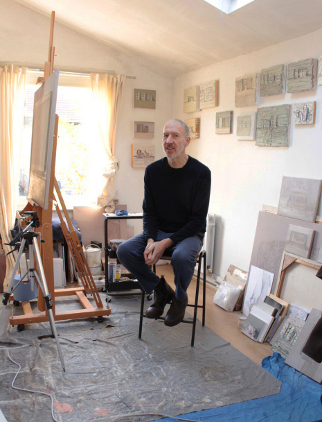
Alex Hanna: Artist of the Month
Artist of the Month March 2022:
Alex Hanna, selected and interviewed by Paul Newman for CBP.
‘I have been working on ideas based around the ‘ambiguous’ and materiality. This possibly explains the choice of subject and the reductive colour system. I have been using both traditional materials and some more none traditional paints. At times I have found the need to explore the boundary between representation and abstraction and how the material qualities of paint become the subject.’
Alex Hanna
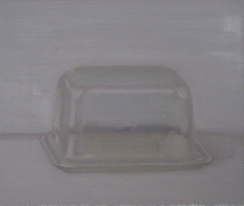
Multisurface, oil on panel, 15cm x 20cm, 2021 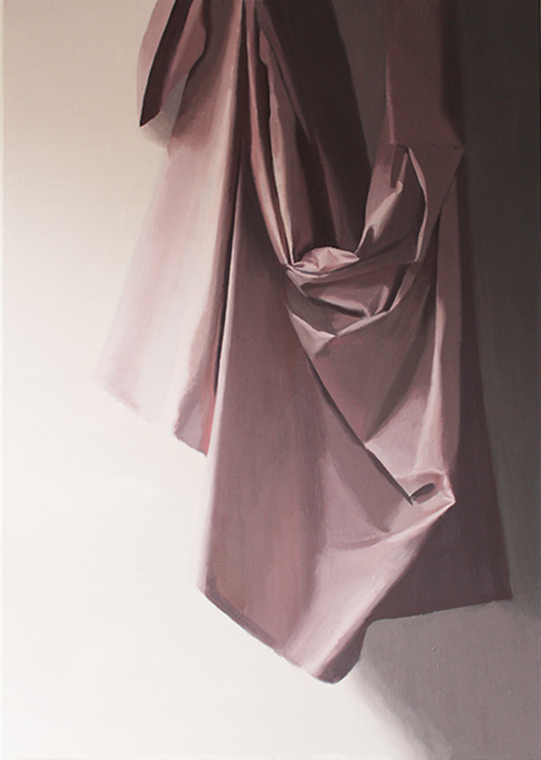
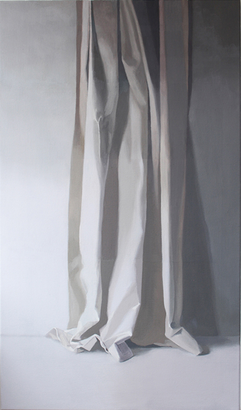
Martyrdom, oil on linen, 115cm x 80cm, 2020
CBP: ‘Multi surface’ and ‘Martyrdom’ are two recent paintings depicting drapery and folds. They have a sense of drama with the light and shadow and are loaded with connotations such as art history and its depictions of drapery in painting and marble sculpture in museums. Could you discuss the ideas underpinning these works?
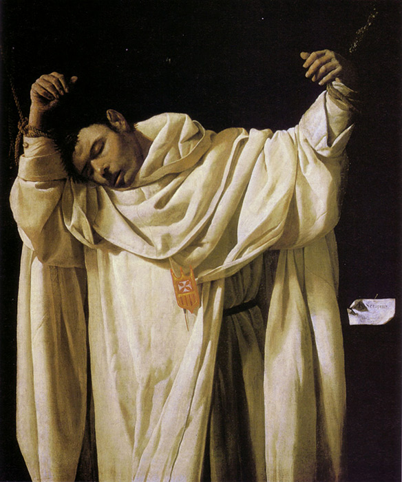
AH: In these paintings I have tried to connect my painted images with historical works by artists such as Zurbaran, Vermeer, Velasquez and Caravaggio. I have found Baroque art in particular a rich source of fascination largely because of the energy and power often embodied within materials such as fabrics and draperies. I keep finding myself looking at paintings from this era in the National Collections. Painters such as Rubens and Van Dyke used fabric constantly as a compositional device as much as a way of directing emotion or drama. Baroque artists were interested in the notion of divine light (light equals god) and drama, which seems to connect with certain religious ideas. If one refers to St Theresa’s autobiography, she describes the experience of being pierced with an arrow and the intense sense of ecstasy (both spiritual and inferred sexually). They usually focus upon the pinnacle or high point within a subject which emphasises this drama. Within my recent fabric paintings, I have used studio spotlights to control the light source. The arrangement of the fabric, light and viewpoint often takes as long as the painting and can involve many digital images and drawing to ‘discover’ the images and compositions which I feel may capture some of the qualities and ideas suggested and to reveal a sense of ambiguity. Drapery its self is an embodiment of many of these characteristics and was used to supercharge and power strong emotional feelings.
Three figures, oil on canvas, 130cm x 75cm, 2021 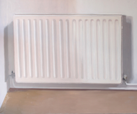
Radiator 2, oil on linen, 90cm x 110cm, 2022 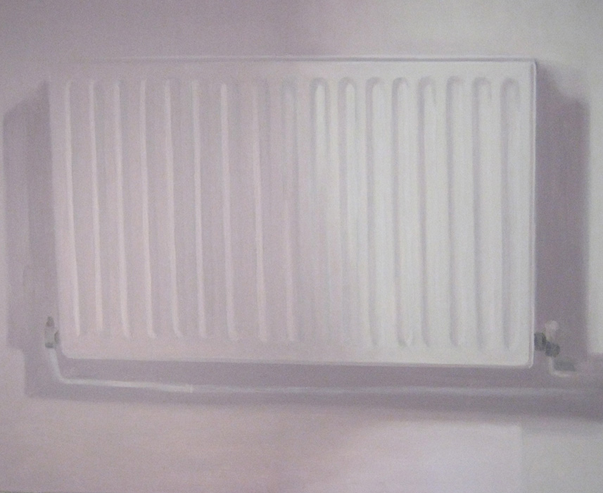
Radiator 2a, oil on linen, 90cm x 110cm, 2012
CBP: You are currently revisiting the radiator paintings, they have an affinity with the pill packet series, their rectangular form and rounded edges, and the way the contours and crevasses structure the light and shadows. Could you talk about these works and what pulled you back to them?
AH: The repeated forms and shadows reflected in the radiators surface and the almost two-dimensional nature of their design means that they are well suited to a shallow space and present calibrated sense of colour and tone across a plane. This has proved to be an evasive subject with constantly changing configurations of light, tone and colour values. Looking through some old images of ‘Radiator 2’ I realised that at one earlier point, the arrangement of compositional elements seemed quite interesting, and I decided to rework the whole painting, this was to achieve a more varied composition, from the almost monochrome grey that I had used at a slightly later stage. This meant preparing my studio and moving things around to enable a better view of the actual object, so that I could work directly. I also took some digital images as well. The painting was started in 2012 and ten years later it is still proving to be every bit as complex to assess. The fractional variations in tone and colour across a plane (with a regular undulating surface) means that they can be appear warmer or cooler depending upon the relationship between different surface changes and the lighting conditions at the time. Value meaning on the canvas cannot always bear a relationship directly to the subject. It has it’s own dynamics within the colour balance that has been initiated. In other words, the colours and tones on the canvas have their own interplay, which generates a particular visual interplay separate from the real.
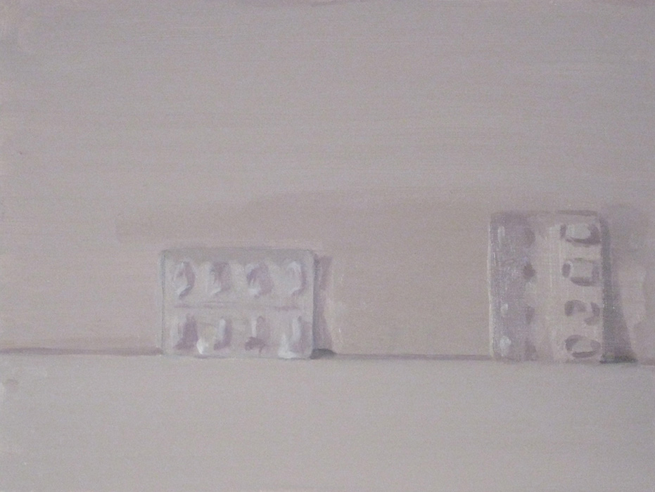
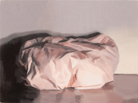
Pill packaging 2, oil on board, 30cm x 40cm, 2013 (Falmouth Art gallery) 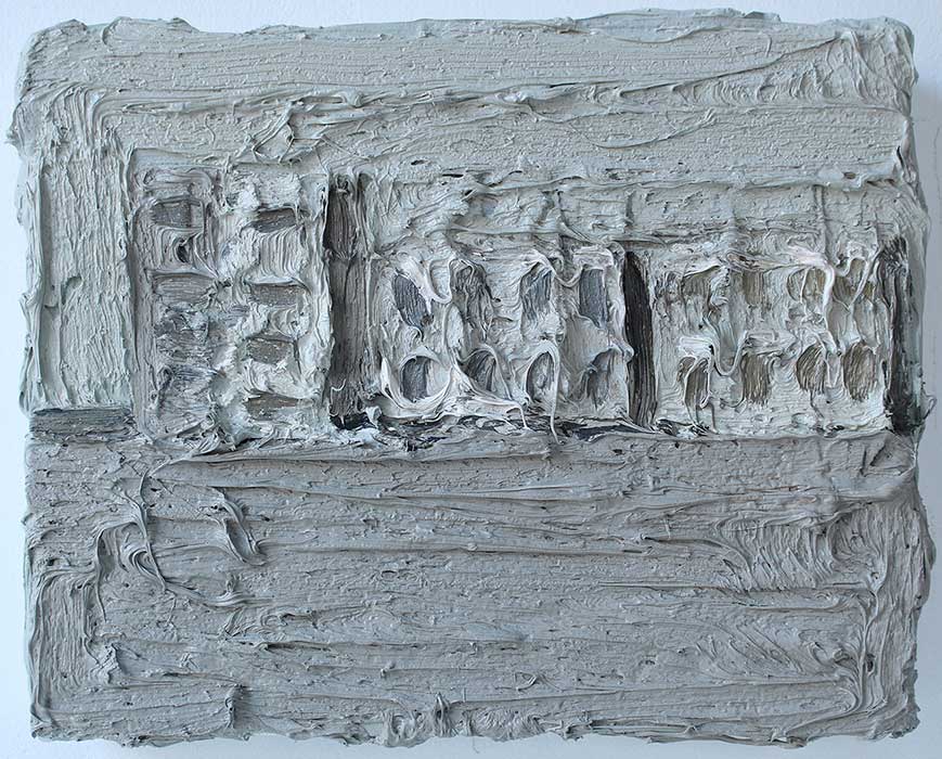
Row of pill packs, oil on panel, 20cm x 25cm, 2017
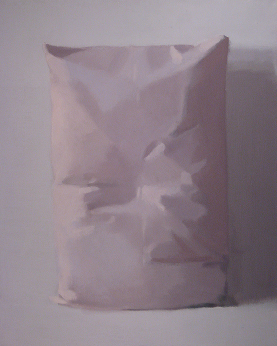
CBP: You use a contained or reduced colour palette that extends from white tones. It’s a sound base to depict light and shadows as a theme of the work. The heavy white impasto paintings hold actual shadows in virtual sense through raking or directional light source onto the painting surface. Is the use of white paint primarily a strategy in the depiction and creation of shadows in your paintings? Are there other factors for working with white too?
AH: The use of white as the base and foundation upon which much of the colour and tone is developed is usually a direct result of how I have tended to mix and create colour values. Also the type of paint used has an impact upon the paint thickness and materiality of the paint. In recent works I have not used the thicker industrial paints, and this has meant a flattening of the surface. At present I am happy to avoid the heavy impastos and surface variations. In terms of the use of white as an admix, it has become part of the paints composition and substance. Different types of white have an impact upon how the paint looks and handles. For many years I have used lead based white paint, which was widely available until about 5-6 years ago. Now it is harder to obtain because of health and safety concerns. However, it is still possible to buy (at increased prices). I find that Titanium has several issues, (slow drying, synthetic consistency and finish). I often mix lead white with titanium to cover large areas. The semi-transparent quality of lead-based paint means that it’s best to work in several layers (which I like). This builds a history of marks, which becomes evident when one must make changes over previous work.
The other colours that I use in my pallet are Yellow Ochre, Cadmium Red, Ultramarine Blue, Emerald Green and Ivory Black. Essentially this is a warm pallet and avoids the invasive Viridian and Madders which can have a dominating and colder influence. In fact the Emerald is not used very often and has a minor role in any colour mixes, most of the work is done through the constant variations and interplay between yellow ochre, cadmium and Ultramarine. The blue can at times be substituted with Ivory (this works almost as well as a cooler), rather like the pallets used sometimes by Rubens and Van Dyke.
CBP: ‘Looking like paint’ is a quote you used in a podcast interview with Lucy Cox. There is a real push pull in approaches to painting in your work; from a representational style like a Manet or Luc Tymans, to ultra-thick impasto like an Auerbach Painting where a pill packet is barely detectable and some like ‘Pink on Pink’ which appear purely abstract. Can you discuss the relationship and contradiction between the object you paint from and paint doing its own thing, on its own terms?
AH: The material nature of both lead based paint and industrial paint can share some similarities and these became gradually more central to my practice several years ago. I became interested in building up a painting so that the paint became part of the subject and the painting became a thing in its self. By replacing the lead based paint with the same paints used by Auerbach (industrial paint) I sought to build a surface that had a character and history about the nature of paint and its behaviour.
CBP: Your painting deals with the theme of mediation, things that are filtered, or translated from one version of it to another. You talk about the use of photographs as a referent as well as the actual objects, and even your own paintings are a source image to paint from, if this is correct? Can you talk about working from different types of references in your work?
AH: The idea of meditation and images seem to go hand in hand. I think that when you spend a large part of your practice looking at and assessing objects and arrangements of them you must meditate and reflect. If one photographs an object, then the photograph becomes a new thing and has its own objective dynamics, which can be seen as separate from the original source. If a painting has 3D qualities (thick impasto etc) then it could be seen as an object and become a subject for a painting (painting becomes painting). With several “imitations” (paintings of images of paintings) I produced what amounts to a ‘Trompe-l oeil’ of a painting. The painting was digitally photographed and then the resultant image was then the subject for an image based painting, see link http://www.alex-hanna.co.uk/imitations.html Once one attempts to follow an image in a direct sense questions regarding illusion and reality are close by.
CBP: There is a calmness to the depiction and composition of a lot of your work like a Chardin still life painting. Could you discuss the arena of still life in your work and in relation to art history references?
AH: Painters like Morandi, Chardin, Gwen John and many Dutch still life painters have created painted still life images which both capture a sense of still and calm but also a meditative relationship with the object. I wanted to incorporate this within my own works because I felt that this created an interesting dialogue with the still life genre. Many of the earlier Dutch painters used arrangements of selected objects to express ideas and narratives. A grouping of objects can and often does become arranged according to a narrative or idea/concept. Even when its just one or two items. I’ve always liked the way that Corbet and Zurbaran captured a sense of the monumental when depicting the everyday. For example a bowl of apples can almost seem like boulders. Looking for historical relationships can often help when one is trying to gain an understanding of a particular visual idea.
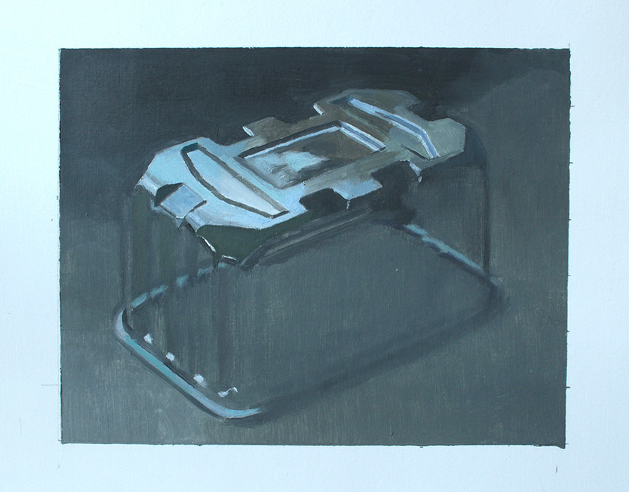
CBP: The objects you paint, feel figurative and reference other bodies. For example, ‘Pink Pillow 11’ is like a torso, and ‘Incubator 11’ depicts a disposable plastic food container that indeed alludes to a hospital incubator. Could you discuss the notion of the body in your work in connection to the vessels you depict?
AH: To some extent it’s derived from a desire to paint the figure/nude which has played a significant role in classical art. I didn’t want to miss out on relating surface materials and objects to the forms of the body. The idea that an object can operate or represent something else can be very compelling and can remove the constraints sometimes associated with painting simple everyday objects. The idea that they can become something other or that a transformation can occur brought on by painting is strangely stimulating.
CBP: There’s something about the whiteness, the shallow space and bareness in some of your paintings that bring to mind Gaston Bachelard’s book The Poetics of Space and early photographic works of James Casebere, like his cell images. There’s an almost indefinable haunting resonance to them. In fact there is a ranging emotional tone in your painting from the cool and analytical to the hauntingly melancholy to a sense of drama, often at the same time in the works. Could you talk about this?
AH: It’s interesting that you have mentioned Bachelard, who’s “Poetics of Space” I read many years ago as a way of understanding the relationship between my living space and my own painting. It allowed me to interpret my surrounding studio space as a subject and that this living area had a strong association with what I was painting. In his book many of the descriptions created potential images and ideas for paintings and still does. For some reason they seemed to imply a reductionist approach to the visual. I can see the tonal link with Casebere and the reduced compositional arrangement; however I have only recently become familiar with his photographic works. The use of a limited pallet has meant that when interpreting a subject one also subdues colour and this feeds through into what one selects to paint. Some of it is also a result of modernist utopian ideas relating to purity of materials etc which has somehow managed to seep through.
Wadsworth Atheneum Hartford Connecticut
Alex Hanna has exhibited at the Royal Academy of Arts, National Museum of Poland Gdansk, COS Coal drops yard, Yantai Museum of Art China, Bowery Gallery Leeds and Bermondsey Project Space. He studied at Sunderland University and Liverpool John Moores. Recent exhibitions in 2021 include; Alan Kluckow Fine Art Winter Exhibition. Thing Worlds, Korin Spot Gallery, Kyoto. ‘Stand close and breath me in’ Oceans Apart Gallery Salford & Pineapple Black Middlesbrough. Connect, The Vanner Gallery Salisbury.
Further links:
The Alchemy of Painting essay by Robert Priseman
Still Life Ambiguous Practices in conversation with Frances Woodley