Marco Cali: Artist of the Month
Artist of the Month July 2021: Marco Cali, selected and interviewed by Paul Newman for CBP.
Marco Cali is a UK artist and curator with teaching experience and a parallel interest in writing, cinema and theatre.
‘My practice looks at two aspects of narrative: How visual media, text and art convey memory, history and the passage of time. What is the English narrative and how do I (an Italian by birth) relate to it.
When looking at narrative, I am interested in the relation between everyday ‘reality’ and artistic or creative traditions and culture. How fiction is constructed, narrative is structured and how this can be played with are the starting points from which I begin…’
For this feature Marco discusses his recent body of works on paper with elements inspired by historical cartoon figuration.
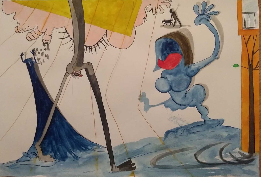
CBP: An immediate impression of these works are a crepuscular version of a type of early to mid 20th century cartoon imagery that are playfully sinister. They are graphic in terms of pictorial style and also graphic in some of the disturbing elements like castrated figures. Can you talk about the relationship between the cartoon and the grotesque in your work?
Marco Cali: I’ve always been a big fan of grotesque, earthy cartoons and animation that mix humour with earthy elements and slapstick violence. Amongst many influences is Max Fleischer animation pre censorship for instance. I like the narrative elements that exist within the logic of what is being told such as shadows coming to life, anthropomorphic animals or objects, time loops and elements that break the rules. A typical example of this is when gravity itself is treated as an actor, coming into play only after a character has realised the mistake, like in a Roadrunner cartoon say.
Fleischer along with many others such as Ralph Stedman, Goya, Breughel, Buster Keaton, Charlie Chaplin, Dario Fo and so on, are all fools in the Medieval sense, who mock and are expected to mock those around them, they seem to revel in the carnival of human behaviour.
Cartoons have a logic on the page or within the movie frame. Those in the hand drawn tradition or influence turn on how a line is made to be read. There is a strong tradition going back, with peaks of sophistication, such as 18/19th century political cartoons or Japanese/Chinese prints and ink painting of 17-20thC.
Other sources of image inspiration are novels, usually writers that have black humour, surreal or magic realist qualities. As a for instant recent ones I’ve read such as Fernanda Melchor, Helen Oyeyemi or Domenico Starnone.
CBP: Do you utilize a process of automatic drawing? And how do you utilize your visual references; are they recalled and remembered, sketched out, or do you use visual aids, from books and screen captures?
MC: My current process is something of an automatic drawing method where the initial step might be a particular figure or subject by one of the artists in the classic canon, from some observation or experience in my own life or taken from some other image source. Typically it’s a juxtaposition of an architectural element brought in as a graphic device, or an allusion of space using very basic colour and shape juxtaposition. I often refer back to silent film, noir and early 20th Century animation or graphic techniques. Also the way the earliest photography could combine extreme detail along with very atmospheric and suggestive light and dark within an image. I like the way these very different traditions bleed freely into one another, both on formal levels but also within our collective and individual experience, a visual vocabulary that is rich, complex and widely understood.
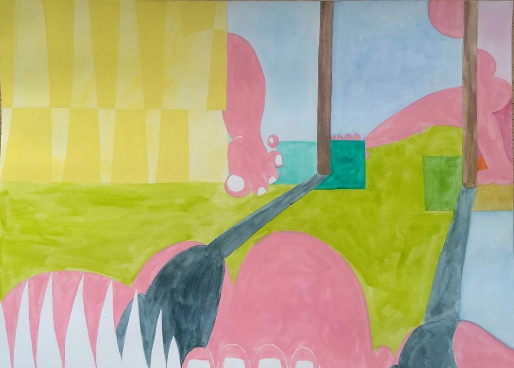
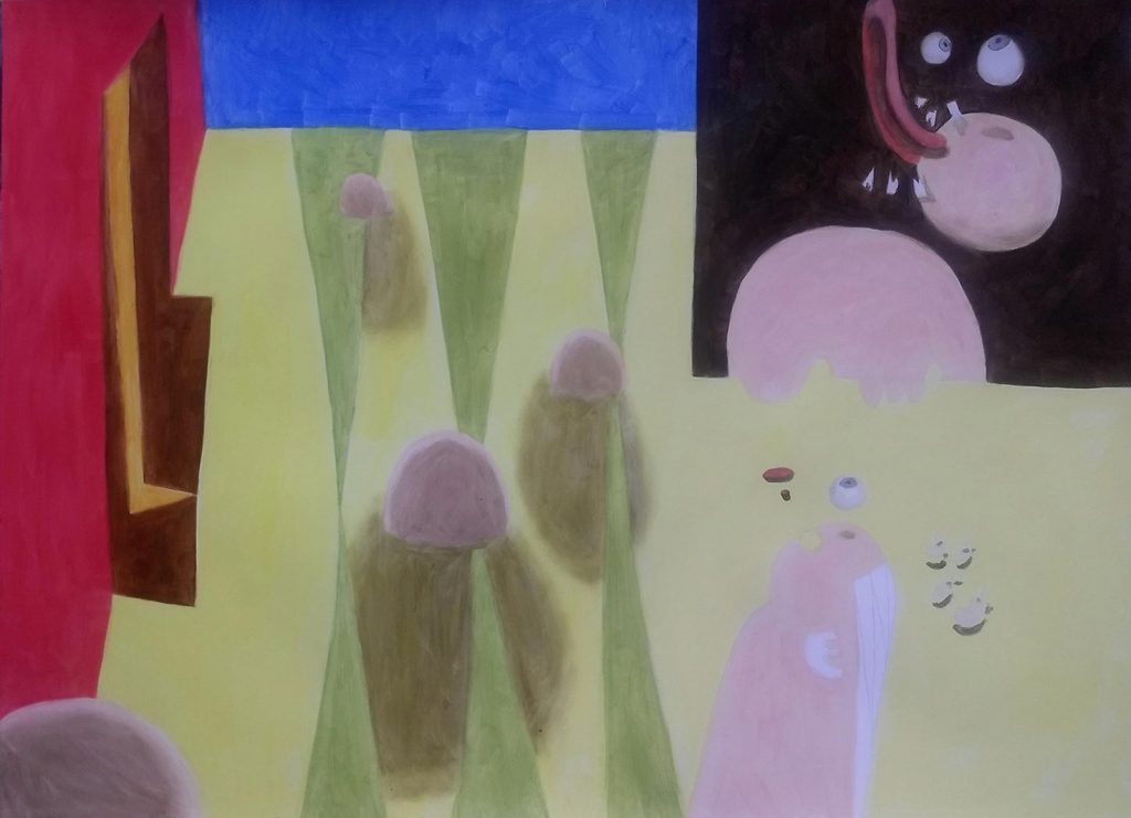
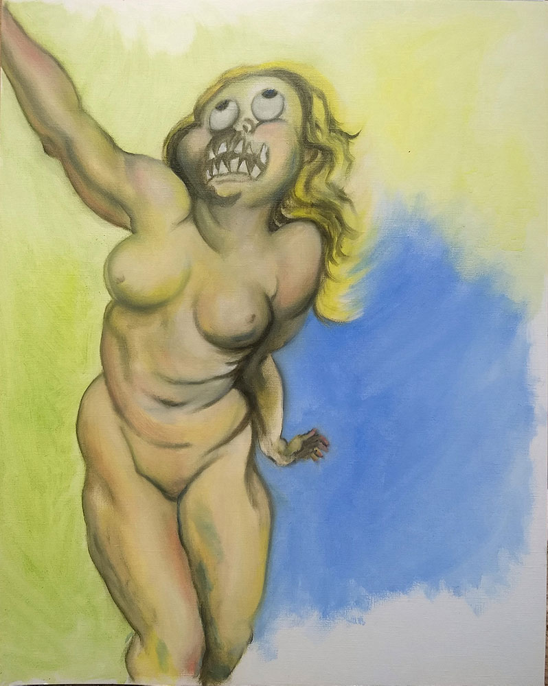
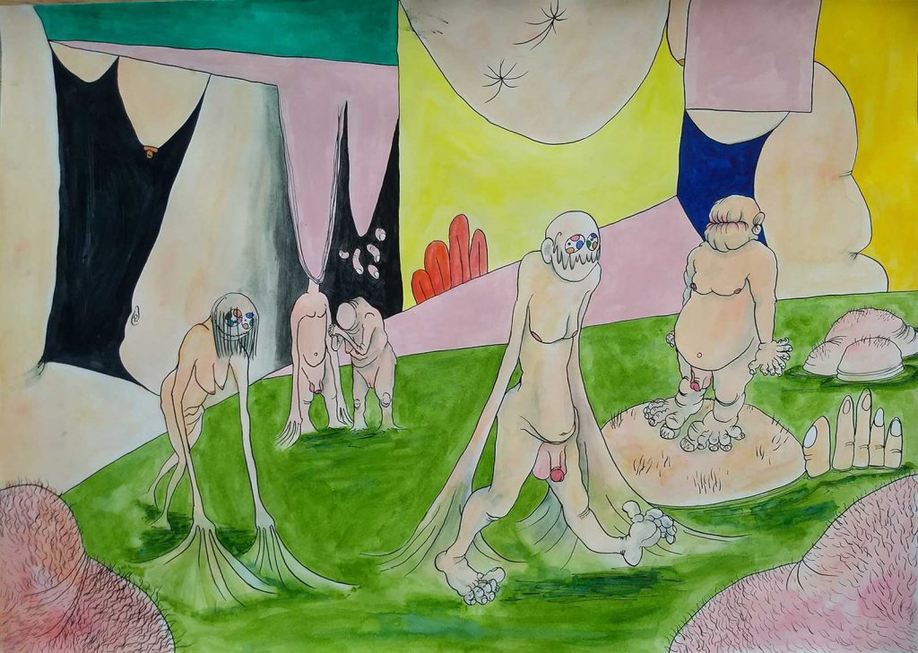
CBP: Could you talk specifically about the figures and body parts in these works? They are naked, often disembodied, with different skin tones. Some are cartoony like plastic doll or automaton parts and others allude to Renaissance Art depictions of the figure. Sharp teeth are prevalent.
MC: One element I’ve worked with on and off, is that of the body as represented within an abstract space. I like the suggestion of movement, depth and narrative that can be worked towards. A sense of absurdity and theatre is something I aim for. In some way, I have always been transfixed by theatre where staging and lighting can create whole worlds with great sophistication and simplicity.
Pretty much all artists in the West and ex Soviet countries, including film makers, photographers, cartoonists and designers up to really quite recently, certainly up to the 1950s, and even beyond in many parts of the world (Eastern Bloc, Southern European), were trained in what could be called the classic academic manner. In a broad and not overly conscious sense I am influenced by that when I’m drawing on these sources to make work. Poses can recur in differing compositions. Parts of bodies or facial expressions are assembled as necessary. Bodies and parts of bodies are naked because most clothing tends to be indicative of a specific culture, time or place. Also, there is something instinctively grotesque and comical about the human body, as well as erotic and sensual. Inhabiting it is being both its prisoner as well as its controller, however weak that control might be.
I like experimenting with the graphic forms that can be worked from the human figure. There is a logic to how the human figure can be portrayed in space and time that is well charted in comic book history. On a formal level there is also no difference in what line or shape is read as a body, as a spacial feature, or a shadow. I have always been interested in how bodies fall apart on the page, how they can be made to explode, disintegrate, melt. Lately I have been thinking about how saints and martyrdom are depicted in renaissance paintings, when the body is broken in a very melodramatic fashion. This has led to teeth that are depicted as jagged polygons more or less in position, eyeballs and fingers that might float free.
CBP: There is a strong sense a hybridity of influences and references in these works, a mash-up. Could you discuss some of these and how you collage these references together?
MC: I like to use the dustbin of the mind, filling it with as much as possible and then making use of some anchor element to bring it out. I do make a few drawings here and there, often with biro, sometimes quite rough, at other time quite carefully worked. At times I take images with the camera phone, careful with composing the photo, usually to remind me of a situation or because of a striking visual effect. I also collect some adverts alongside images of classical paintings and drawings.
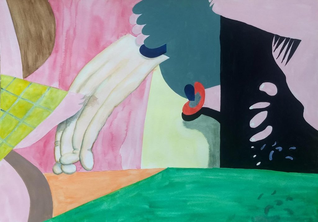
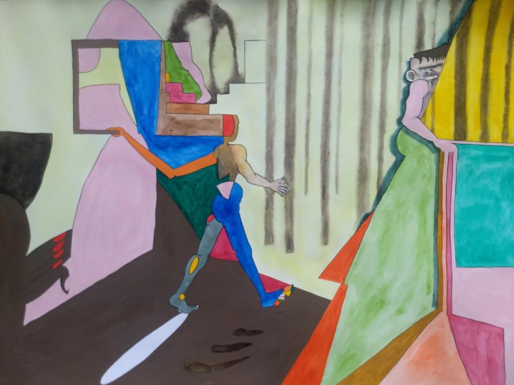
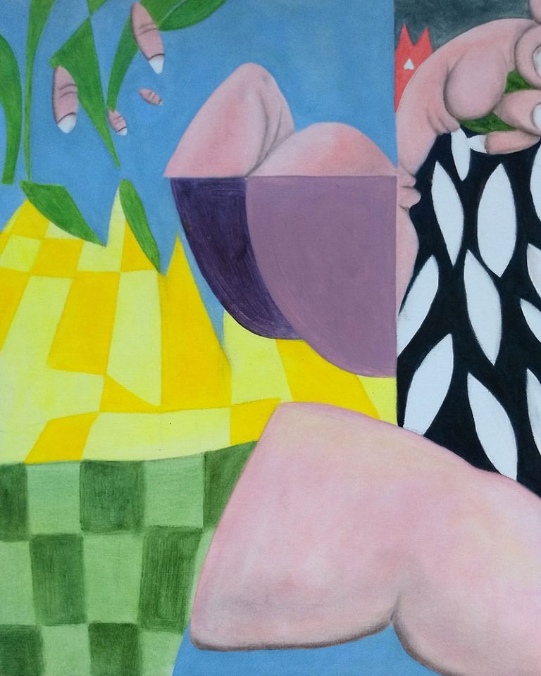
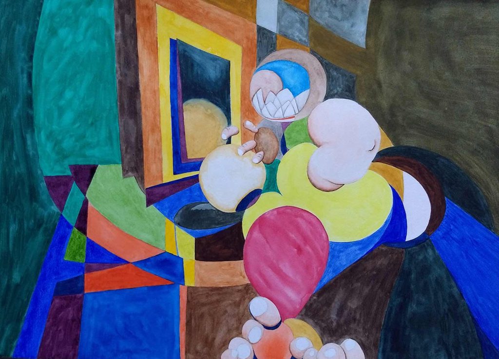
CBP: Can you discuss the push / pull of pictorial illusion and flatness in your work in relation to spaces these figures inhabit? Figures are meshed into semi abstract spaces, alluding to both landscapes and architectural spaces and feel like they are interior spaces in terms of their psychology.
MC: I am really interested by the way differing solutions to how spaces, both interior and exterior, are depicted. From graphic solutions of naïve or folk traditions, all the way to contemporary movies and computer graphics. I tend to gravitate towards the simplification of these solutions, often with the way colours and form can be used as a kind of visual gag.
Of the images I have made, the ones I am most satisfied with are those that neatly combine many graphic solutions whilst holding a sense of composition and narrative. When depicting architectural elements, I like how exterior and interior can be made to fold into one another, how they might in turn combine with landscape, light sources and shadows. On the page of course they all have an equivalence because they are all made of the same stuff.
Overall I suppose, there should be a sense of dream like fairy tale, but of course fairy tale as in the unease of those twilight moments. I like the way environments stretch and shape behaviours and mood.
Untitled, oil on paper, 50cm x 40cm, 2021 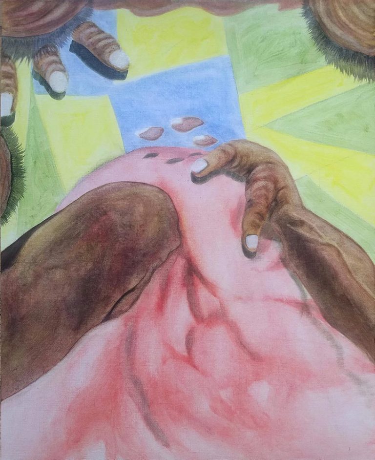
Untitled, oil on paper, 50 x 40 cm, 2021
CBP: You work in series and this series appears different stylistically and in terms of imagery than previous series such as ‘Satyrs’ and ‘Fenton’ which incorporate, historical military type imagery. How did this current series evolve from earlier bodies of work and is there an overarching web of philosophical or political approaches to your practice?
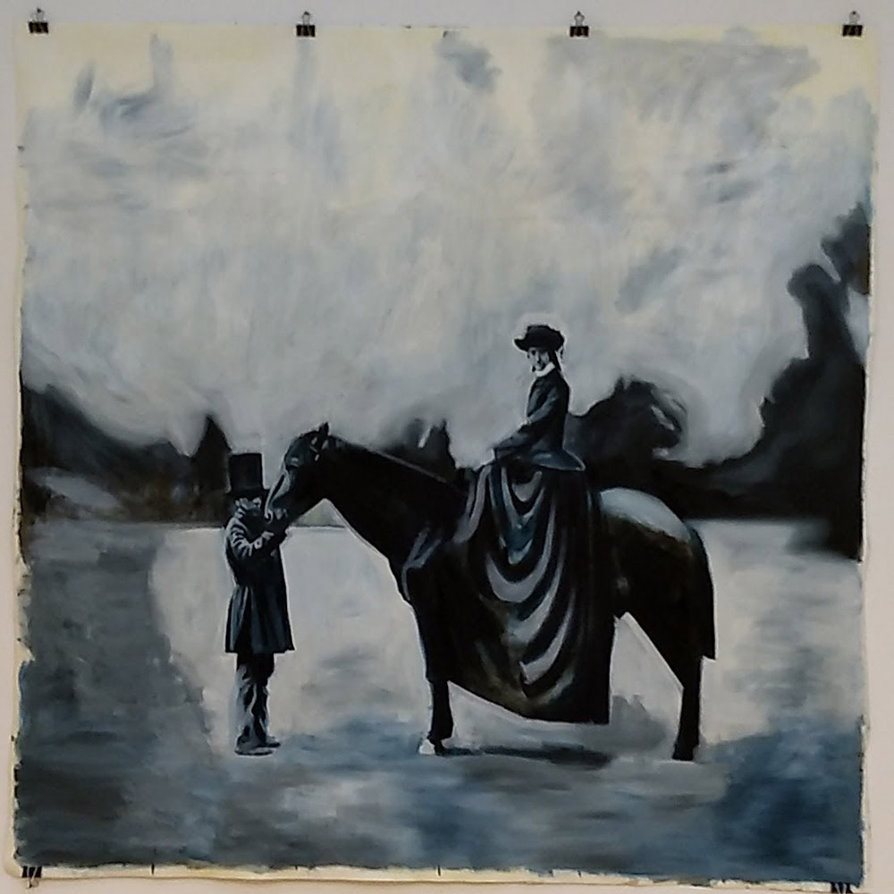
MC: Some ten years ago I started thinking about what interested me in painting and I wanted to go back to some sort of roots of what that might mean for me. I decided that a good point to start was when painting and photography first crossed paths. I reasoned that at this point, the moment when photography as a technology was introduced, is decisive because one influenced the other and painting could never be the same again. Of course, film and now the digital realm are a continuation of this. At the same time I was looking for something that had some affinity with my personal history, however marginal that might be.
It turns out that the Crimean War is considered to be the first conflict to be photographed. This conflict between the empires of Britain and France against that of Russia saw the participation of the Kingdom of Sardinia alongside the former. This persuaded the British and French to actively back Italian unification. I like the absurdity that were it not for the memories recorded within these images, then I would not be making these paintings. The lenses and chemical technology of these early cameras created very sharp details in one part of the image, usually centred on the main subject, with the rest of the scene reproduced as very suggestive blobs and scrapes of dark or light. Among other things, it struck me when painting from these images how powerful a dark smudge against a light shape could be in conveying memory and loss.
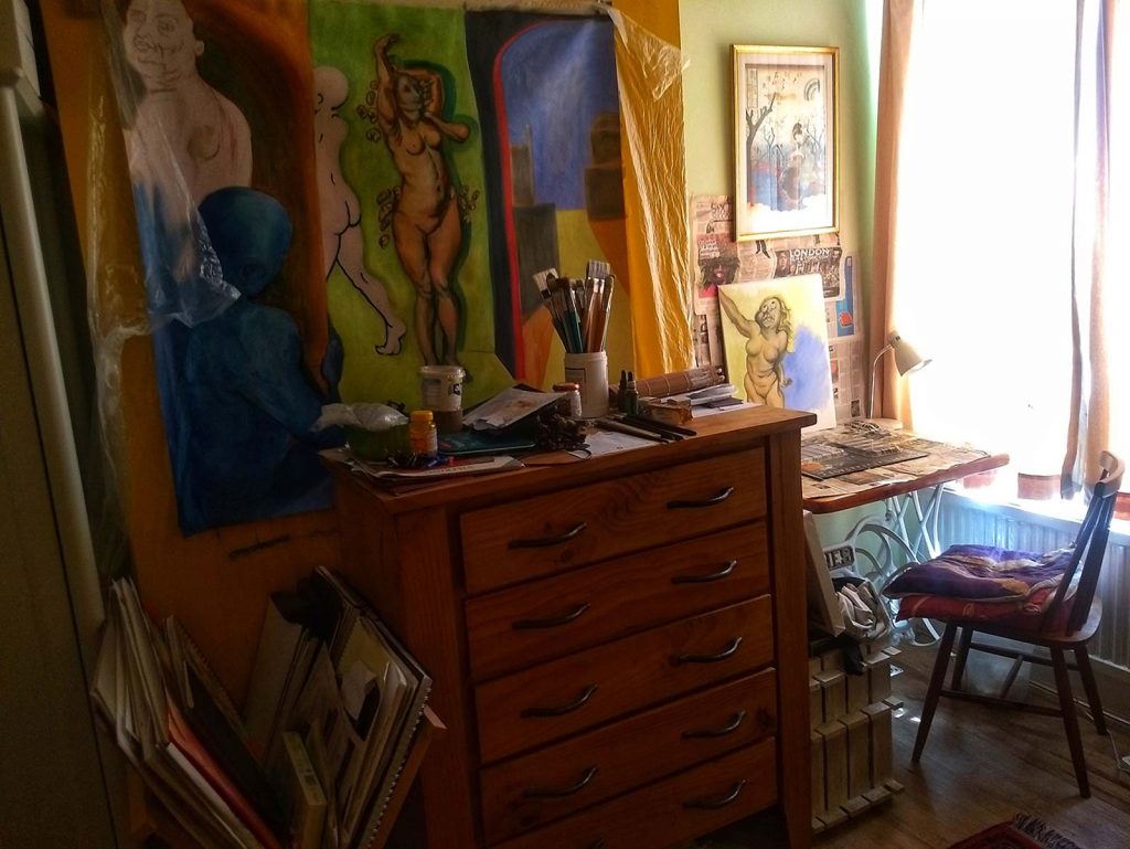
CBP: What is your current studio practice and routine? Was your painting and location affect by the pandemic?
MC: Up to March last year, my studio was reasonably large at 5×3 metres or so with walls that meant I could fix unstretched canvas and work up to a large size. It was a really great feeling to be able to do this as I much prefer a gestural style when painting with oils. However, since then I’ve had to create a working space in a small room in our home. The great outcome of this has been in picking up water based paints again and going back to the process of making an initial pencil drawing. This has suited thinking through to the final image, even to the point where drawn lines are made in recognition of the likely paint colour that will follow. Overall, of course, it’s nice to intuit how the shapes work together in the overall image. These images are the result of an intense period of work that I am now bringing back to larger formats.