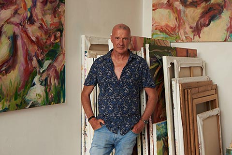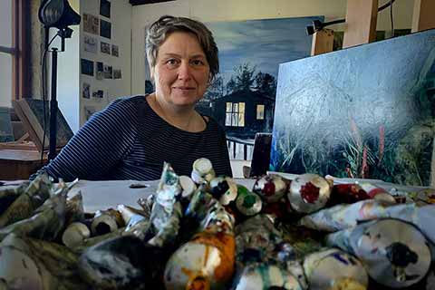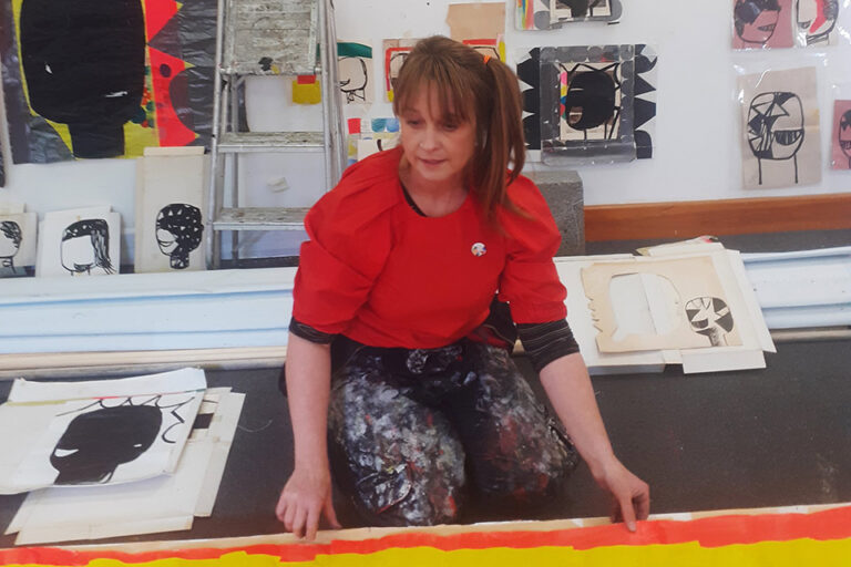
Paula MacArthur: Artist of the Month
Artist of the Month August 2022:
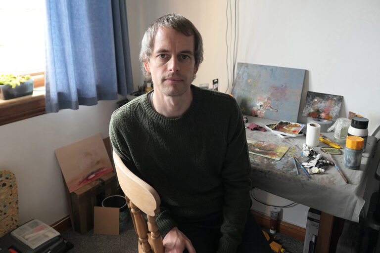
Paula MacArthur, selected and interviewed by Paul Newman for CBP.
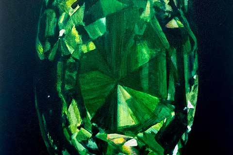
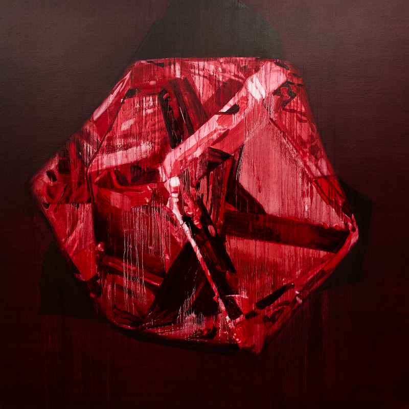
The current focus of Paula MacArthur’s work is crystals and jewels, these are explorations of colour and light, a contemporary response to Dutch 17th century Pronkstilleven painting – ostentatious still life. Solitary, precious stones are captured in the spotlight, displayed as icons which lure us in and quietly invite us to investigate the multifaceted associations we bring to these treasures.
CBP: Can you talk about the starting point for painting images of gemstones and crystals. Was it a particular museum visit that ignited something in you to paint this subject?
PM: In a roundabout way, yes it was. I first went to the Natural History Museum with a very specific idea in mind. I wanted to make a painting of fifteen cut stones as a gift to my husband on our fifteenth (Crystal) wedding anniversary. I thought I’d pop into the museum, take a few photos to use as a reference and then go and visit some other galleries, but I ended up spending the whole day there and coming away with hundreds of photos. Unusually for me I decided to make a watercolour as I was thinking of the painting as a sort of greetings card; almost as soon as I started making that watercolour I realised I’d hit on something which had a great deal of potential. That must’ve been back in 2010 and apart from a period when I became distracted by other shiny objects, I’ve been working on these ever since; we’re just about to celebrate our 27th anniversary.
Incidentally, I just discovered that the traditional gift for a 27th anniversary is music and thought it was worth mentioning that music is a very important part of my process. It helps set the mood and more often than not I take my titles from particular lyrics which stand out to me while I’m working and seem to fit with the things I’m thinking about. Sometimes, when painting, I feel like I hear lyrics in familiar songs that I’ve never really noticed or paid attention to before, they resonate with the ideas I’m bringing to the painting and as titles I think they suggest a way into the work. They are usually love songs and I for a long time now I’ve thought of my paintings as love songs too.
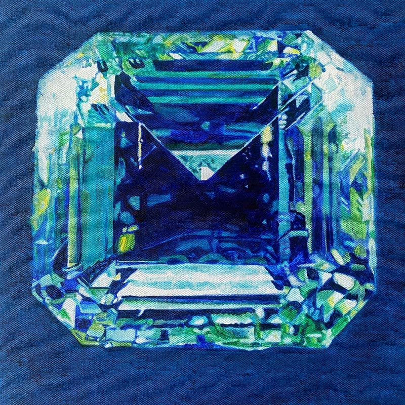
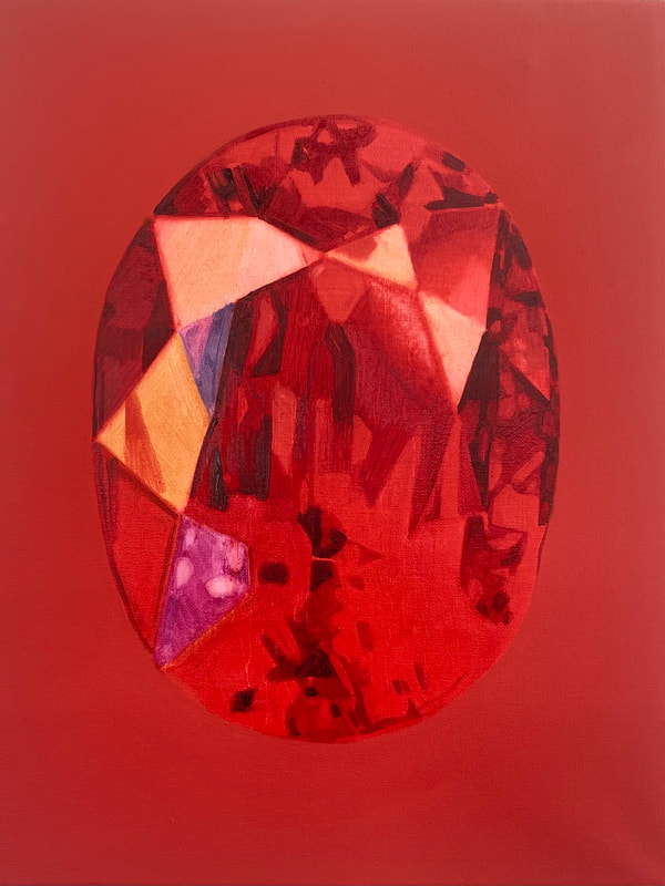
Let the water hold me, oil on canvas, 40 x 40cm, 2021, Private collection 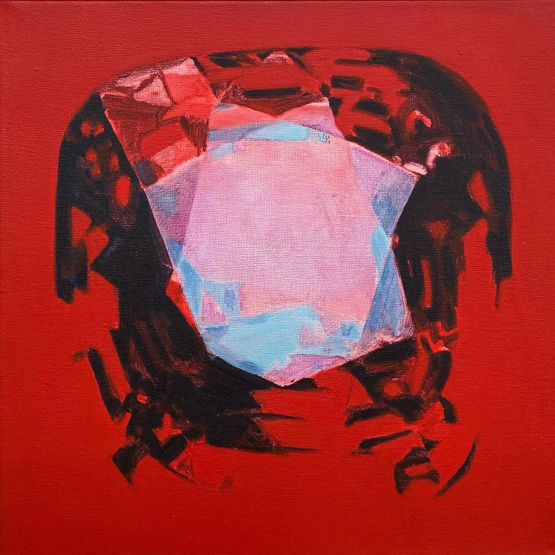
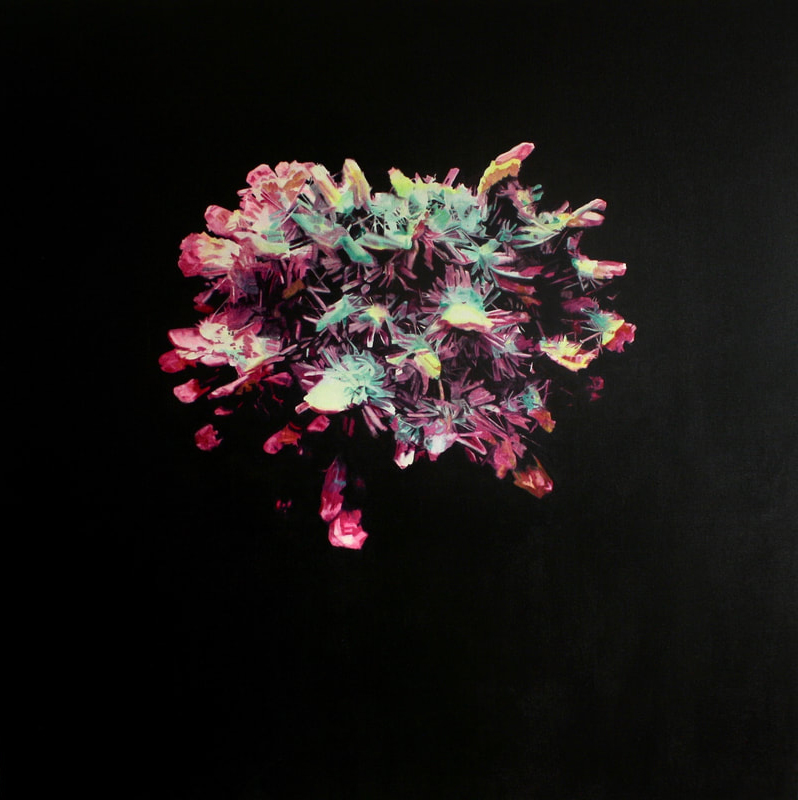
Still I’m going to miss you, oil on canvas, 30 x 30cm, 2021
CBP: The process is important for the painter and sharing with viewer something of that journey. Transparency feels like a key part of this process; how you depict light through building up layers in terms of translating the source imagery and how the painting emits its own light. Can you talk about this process of transparency and the evocation of light in your work? I’m assuming that your paintings are built up in layers, they could be painted across, built up like a jigsaw puzzle too.
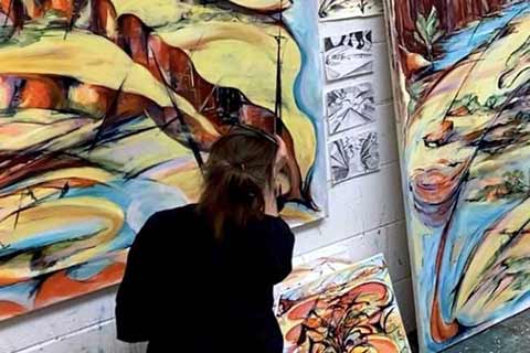
PM: I do think in terms of a jigsaw; particularly when I’m focusing on getting the drawing within the painting right. I draw a grid of thirds and quarters onto the photo I’m working with and I mark this onto the wall around the canvas (rather than on the canvas) to use as reference points and although I do start drawing with a line I’m thinking about different coloured shapes butting up against one another, they sub-divide and eventually click into place to describe the form.
I also layer colours. The transparent pigments have similar qualities to the jewels themselves; they allow the light to bounce through the paint, off of the white primer underneath and create that glow. I often work in layers of a single colour to begin with, usually working light to dark, it’s much like a reductive printmaking process, I start with the palest colour and wipe areas away to reveal the white primer to draw in the brightest highlights, then I’ll do the same with subsequent layers. It sounds like a very methodical way of working but often I skip between working on the whole canvas and focusing on smaller areas and at some point along the way this methodical approach is completely abandoned, as is the photo and I find myself flitting across the canvas, adding colour, removing it, balancing the light and shadows until there’s nothing more to do.
Using transparent colours over a white ground is crucial, I layer my colours, sometimes wet on wet, sometimes wet over dry layers, it depends on how quickly it’s all drying mostly. I add thin glazes and often working with just three colours mixing them on the palette but also by overlaying them and mixing them on the canvas. A few years ago I sorted out all my tubes of paint by opacity, the transparent colours are on my palette and the opaque and semi-opaque ones are put away, they’re there for use in emergencies. I hardly ever touch them but having said that the Titanium White has crept into a couple of paintings recently even though I have a real dislike for it. I used it in a painting I made on marble to create the highlights against the colour of the stone to create an illusion of the front facets against the facets at the back of the transparent stone. I think I might continue to experiment with working on marble, but mostly I only use white paint like Tippex. White allows me to start afresh on a particular area of the canvas if the colour has dried too quickly and I can’t remove it.
In the past I’ve added kerosene and safflower oil to my paint to extend the drying time of my colours, this allows me to continue to make changes over an extended period and so avoid the use of white. In 2018 I was fortunate to be selected for an artist residency at Winsor and Newton and was able to work with the Paint Chemists there to create a medium to slow down the drying time. Inspired by Willem de Kooning’s ‘blubbery’ paint mixtures I started working with recipes which included safflower oil and water, and adding kerosene which despite being an oil, behaves like a solvent and much to my surprise it also helps the water mix into the paint to create a slippery, fatty mixture which dries very slowly. The Chemists strongly advised against adding the water which would expand and contract and potentially cause cracking over time so I tried without it. The resulting mixture, even in a centrally heated studio, stayed as wet as if I’d just applied it for six days, allowing me to work wet in wet and to cleanly wipe back to the primer but I was beginning to think it might never dry. Then, quite miraculously, the painting dried on Sunday; on Monday morning it was completely dry, the chemists explained it was a very rapid chain reaction but I’ve forgotten the detailed reason why.
CBP: Gem stones can be perfect, they can have flaws. Paintings have flaws, inconsistencies like drips, coagulating areas, where the paint appears to do its own thing. Can you talk about the nature of paint in your work and do you do many corrections?
PM: Even though gemstones often have flaws we generally think of them as being perfect and representing eternity and purity (amongst many other things) I think. I do like to disrupt this with the painterliness of marks and drips and I do enjoy it when I enlarge the photos I’ve taken in museums and a thin layer of dust or some grubby fingerprints are revealed. From a distance (and also on screen) the paintings present a convincing and quite photorealistic illusion but as you approach the surface the illusion is shattered and you’re left with painted marks and drips. The illusion becomes an object which reveals the process and the viewer can start to unpick how the image was constructed and imagine the movement of the brushes across the surface. I think this can be just as seductive as the stones themselves.
I think I also equate the idea of flawlessness with the romantic idea of true love too. We all want to believe we’ll find our Prince/ss Charming, but I also think about the difficulties of love, the pain of loss and even the fear of potential loss that has been the catalyst for so many love songs. Love is wonderful and challenging, and I try to put some of that love into my work, taking care, devoting time and paying attention to what each painting needs. The difficulties serve as a contrast with the moments of joy, and in completing each piece there’s a kind of yin-yang reconciliation between the two.
CBP: Can you talk about how the imagery is translated; what type of photographs do you use as source material? And how do you translate the scale, from the miniature and indelible memory of the gems as artefacts, to enlarged macro photography to the paintings which are often significantly larger still?
PM: Even the small paintings can be a hundred times larger than the original stone, I do like a bit of drama! I think my desire to make such bold statements comes from wanting to communicate the excitement I feel when I come across these treasures, they’re tiny but so powerful. The way a particular stone sparkles can be absolutely breathtaking, the light seems to have an almost tangible energy and it’s really difficult, for me at least, to capture everything I see and feel in a photograph. To start to uncover some of my initial excitement I do a fair bit of digital manipulation on the images before I even think about painting to see if I can get somewhere close to the thrill of first finding that particular stone. A few years ago, 2018 I think, when I was giving an artist talk, I realised that my palette had started to become much brighter as a result of using a digital camera, seeing the images on a back lit screen made everything come alive for me, it took me a rather long time to make that connection as I bought my first digital camera in 1992 but since that revelation I began to work directly from a screen rather than a printed image. Once I have settled on an image I transfer it to the canvas, focusing on the drawing which creates a space for some of the other things I’ve already mentioned to start bubbling up. Mixing and applying the colour is a very sensual process and it often becomes a balancing act too, very fluid paint runs and bleeds as the traces it leaves are suggestive of time passing, an important element of these paintings which I think of as being essentially contemporary memento mori.
CBP: The philosopher Georges Perec called for us to ‘Question our Teaspoons’ what are they? What are they for, where are they from and how are they made? Your paintings of a specific artefacts are loaded with connotations of what a gemstone is, where it has come from, and what it signifies. And this is in relation to the paintings which of course are not gemstones but paintings, objects and artefacts in their own right. Could you discuss this notion of what things are and what they signify in the paintings?
PM: We associate so many things with gemstones and it’s this richness (pardon the pun) that has kept my attention for so long I think. The paintings operate like icons or mandalas, objects of worship or meditation; the process of making, standing back, thinking and looking is always meditative and even sitting with them as finished works there are always suggestions of simple narratives that come in which relate to all manner of ideas; political, environmental, spiritual, philosophical and perhaps most importantly the personal comes in too. Some evoke quite specific daydreams or remind me of past events, people and relationships, this always happens quite naturally during the process, the paintings develop their own characters I guess. Whatever comes in, dark and light, positive and negative, becomes part of the finished work so they can be beautiful and luscious whilst sinister, melancholy or doom laden. I often think of Jun’ichirō Tanizaki’s In Praise of Shadows, ‘Were it not for shadows, there would be no beauty’ and ‘The quality that we call beauty … must always grow from the realities of life.’ So, whilst the gemstones signify all manner of things it is the multifaceted nature of those associations which interests me, these paintings create a space for me to explore myself and the world around me, sometimes I think perhaps I’m trying to come up with a universal theory of everything; I guess we’re all searching for an answer so I hope they communicate universally.
As I said earlier, for me these are contemporary memento mori, or more specifically Pronkstilleven; which has its origins in Northern European 17th Century painting; they’re an ostentatious reminder of the transience of life and the ultimate meaninglessness of wealth and possessions. However, I hope there’s no judgement here, but rather that they’re a celebration of beauty as well as a moment to pause and consider our values.
CBP: Following on from the previous question, the gemstone is valuable commodity or currency, part of a capitalist infrastructure. Paintings are also a commodity, have their own value as part of the art market / industry. Can you talk about this as a shared notion of your depicted subject and your paintings? Is it part of the dialogue within your work?
PM: I hope that these paintings encourage conversations about what it is that we value. As a painter the process of making these canvases is most important to me; I love the challenge of depicting an object through balancing colour and light and the accompanying meditations that accompany the making help me to understand who I am. The resulting object is less important to me, although of course it’s always good to sell a piece and be able to pay the rent and eat!
Putting a price on an artwork is very difficult thing to do as soon as something is sold it has a value and becomes a kind of currency. It can leave a bitter taste but if I consider the transaction to be payment for my time which enables me to continue painting then it becomes more palatable. The introduction of NFTs has turned artworks into another new currency; none of this sits comfortably with me but nonetheless the idea of an artwork as a commodity is embedded in the work I’m making. The context in which the work is seen has a big impact on the way its perceived, in 2014 I showed some of the Jewel paintings in Threadneedle Street, just along the road from the Bank of England; whilst they all looked impressive in a very slick foyer gallery space the obvious link to wealth did, with hindsight, undermine the work somewhat I think.
Gemstones, and diamonds in particular, are only valuable because the market is so tightly controlled; I once heard that if it was possible to share out all the diamonds in the world between the global population, we would all have a cupful each. An exciting idea, we would all have a cupful of beautiful stones and all the unethical practices associated with precious stones would come to an end as the stones would become quite worthless.
What do we really need and what do we value most in life? It’s easy to lose sight of the value of what we already have in the quest for more. In his essay The Soul of Man, Oscar Wilde wrote ‘Ordinary riches can be stolen from a man. Real riches cannot. In the treasury-house of your soul, there are infinitely precious things, that may not be taken from you.’ He acknowledges the importance of valuing our individuality, it is difficult to really appreciate that we are good enough already and have everything we need. I remember once being asked by another artist to choose a motto at random, it read ‘You already have everything you need’, I was shocked and delighted to realise that this was true, although in the chaos of everyday life its not always easy to remember.
CBP: Another aspect of connotative association is the material nature of the mineral or stone, where it comes from in the earth and this relationship with paint, a pigment from minerals in the earth. Can you discuss the shared commonality between mineral crystals, stones and paint pigment. Are the specific colours you use that have a more specific connection to their subject?
PM: Many pigments are made from minerals and this is an area I’m starting to research in much greater depth alongside other associated fields from the ‘woo woo’ to the scientific; I have no idea if or how this might impact the work, watch this space!
I use colour to evoke some of the excitement and drama of discovering the stone and sometimes the colour I use doesn’t relate to the original stone at all. I always exaggerate or even completely change the colours; for example, an aquamarine becomes ruby red and an amethyst fiery orange. In the Rococo series however I did start to use colour in a more conceptual way; these paintings were also about wealth and value and I started to use highly prized, expensive colours like Rose Madder alongside earth colours and Indian Yellow to represent something much more base. Creating the illusion of elaborate, gilded ornament using a pigment which was traditionally made from cow’s urine seemed subtly subversive, a bit like dressing the emperor in new clothes.
I find the materiality of the paint very seductive, when working in a more painterly gestural way I think I use the viscosity in relation to the light, the darker passages are laid on more thickly, the colour really intense and the lighter the colour becomes, the thinner the paint becomes until it’s not there at all, revealing the lightest facets. The thick helps us see the thin paint and the dark manifests the light.
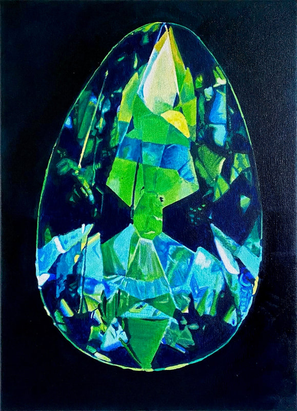
Forever to be mine , oil on canvas, 30 x 30cm, 2021 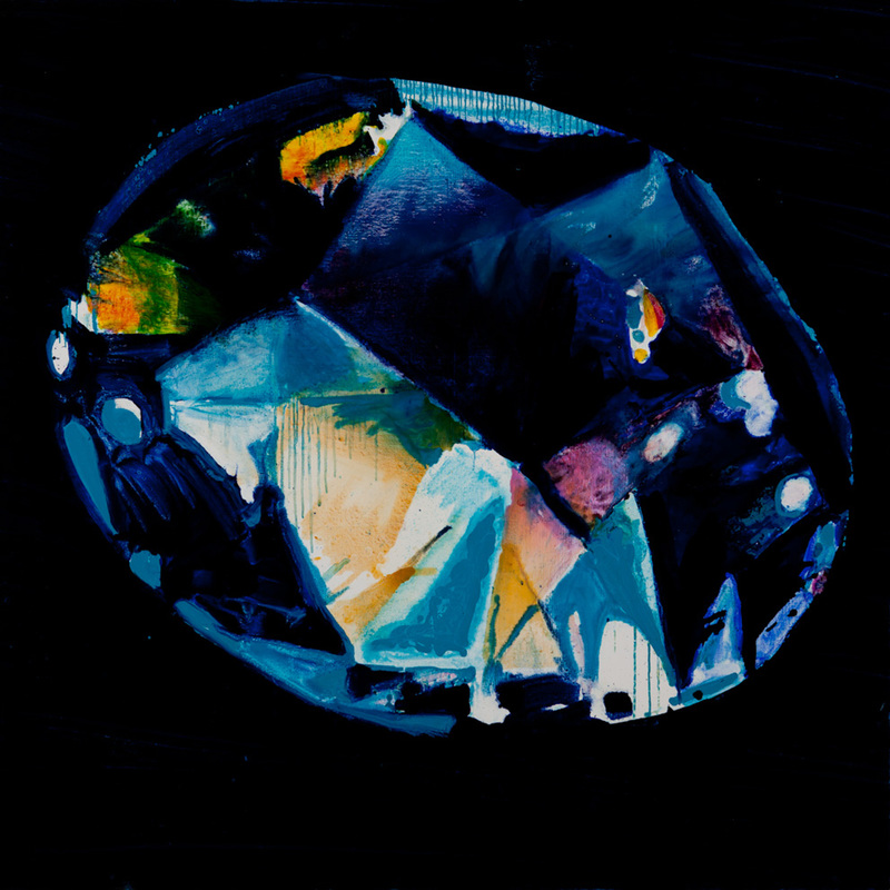
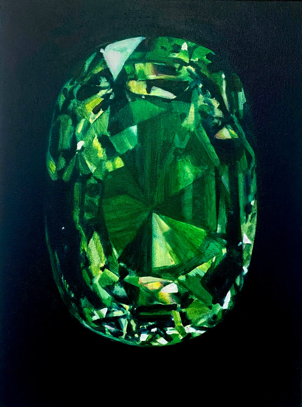
Of course I still love you, oil on canvas, 140 x 140cm, 2014
CBP: You started painting crystal series during lockdown. Can you talk about how did series evolved from the gemstones and some of the differences? There is a sense of something more ominous and foreboding in the drama these works.
PM: I actually made the first crystal painting in the summer of 2019 (I will lead you (out of here)), it felt like one of those occasional ‘milestone’ paintings that surprise you and I knew it was a way back into the gemstone series of paintings. There are two more pre-lockdown crystals which I had to abandon when our studio closed for lockdown and they’re still unfinished, I think they might always stay unfinished, their moment has passed.
I’d always known I’d continue working with the gemstones again but I’d inadvertently put them on hold after a solo show of the jewels in 2014. After the intense period of getting everything ready before a show I often find it difficult to continue work on a series; the studio feels empty, so in spring/summer 2014 after a bit of time off I found myself distracted by a different kind of shiny object, that’s when I started the ‘Rococo’ series and I think I will probably return to that at some point too.
There was a clear link to the Jewel paintings but these objects felt less contained; geometric but also natural, almost organic – to misquote Gaudi; ‘There are straight lines and sharp corners in nature.’* With the jewels I’d started thinking about how the stones have been ‘perfected’ by humans, similarly in the Rococo paintings the designs were idealised versions of plant and other natural forms. I like noticing the imperfections in cut stones, the slightly wonky symmetry or a fingerprint on museum specimens, perhaps I enjoy that they don’t completely conform to the patterns we expect, it initiates a conversation about what, if anything, is perfect and why are we so often compelled to seek perfection?
What really fascinates me about the crystals though is the fact that it’s hard to believe they’re natural. We don’t expect to see straight lines in nature and nothing else on our planet has the same transparency, it’s no wonder that so many mythologies have built up around these seemingly alien artefacts. Although I took countless photos of natural crystals on that very first trip to the natural history museum, years passed before I actually used them. The strangeness of the crystals suggests something rather ominous which wasn’t what I was looking for initially, but I began to enjoy the weird asymmetrical geometry and started to think of the paintings as distant worlds or extraterrestrial landscapes.
My love of science and science fiction began to creep in and when Covid came along the crystals even seemed to morph into viruses at times. Lockdown has definitely had an impact on these works; they’re much more tightly controlled, there are no drips, no ‘mistakes’. This undoubtedly came from a desire for some sort of control when everything had been turned upside down. I remember consciously returning to a tighter drawing style and also restarting the jewel paintings as a kind of self-care; getting lost in highly detailed drawing is something of a guilty pleasure** and the colour and comparative simplicity of the jewels felt familiar and comforting, there’s something in the neatness of the mathematical tessellations of the faceted forms that feels reassuring and complete.
**I must add that through developing this different process I’ve learned to feel less guilty about it and think I should indulge myself much more often!
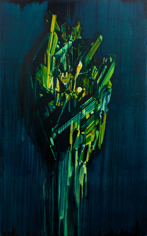
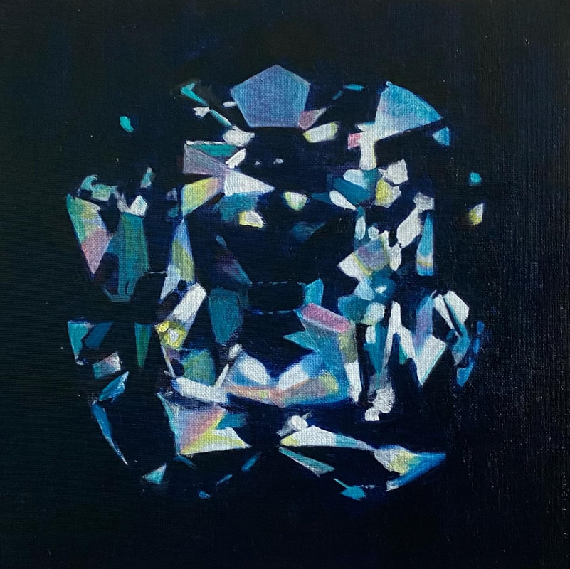
Didn’t I give you nearly everything, oil on canvas, 100 x 100cm, 2020 
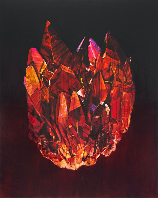
In her own mad mind, oil on canvas, 100 x 100cm, 2021
CBP: You have a co curated the recent CBP exhibition Vitalistic Fantasies at Elysium Gallery in Swansea. Inspired by ideas in Isabelle Graw’s 2018 book, The Love of Painting ‘in which she argues that aliveness of paintings is created not only through the specific ways in which painters personalise their paintings by the traces of activity on the resulting work, but also through the projections of the viewer onto the painting.’ Did this strike a particular chord with the identity of your own paintings and their interpretation? Perhaps in relation to some of the previous questions above?
PM: I knew that this show would include a large number of painters each with quite a different approach to painting so I chose this title as I think that Isabelle Graw’s ideas chime in some way with most painters’ experiences of making paintings and she also considers the role of the viewer in being crucial to the life of any painting.
As painters we are all attempting to communicate through the work that we create and without a viewer to receive or respond to the work the process is in many ways incomplete, both the viewer’s and the artist’s imaginings are vital. I think so often a painting leads the painter and tells them what to do much in the way that novelists create their characters who them tell them how the plot must develop. The painting has voice and a life of its own, very fluid paint moves in response to gravity and we can’t help but imagine the painting actually paints itself. Sometimes we leave the studio happy with the day’s efforts only to return in the morning to find it’s all turned to shit over night and thankfully sometimes the reverse happens too! Sometimes it’s a struggle, sometimes it’s a joy and when the work is done we feel like we’re releasing a new life out into the world, it has to stand on its own two feet and speak for itself without the creator by its side to defend it. It all starts to sound rather fantastical, like we’re imagining birthing a child or creating some kind of monster, maybe making paintings does send you a little crazy sometimes but I can’t think of a single painter I’ve spoken to who doesn’t imbue some sort of aliveness in their work.
* ”There are no straight lines or sharp corners in nature,” Antonio Gaudi
Paula MacArthur trained at the Royal Academy & Turps Art Schools and was a John Moore’s Painting Prize winner in 1993. She exhibits nationally and internationally; and works from her studio in Rye, East Sussex. Paula has recently curated Vitalistic Fantasies with Casper White for the Cello Factory London in 2021 and Elysium Gallery Swansea in 2022.
Paula has exhibited widely in the UK and internationally, was a prizewinner at John Moore’s Painting Prize in 1993 and first prize winner at the National Portrait Gallery Portrait Award in 1989. Other highlights include Made in Britain – National Museum Gdansk Poland (2019), Contemporary Masters from Britain touring four museums in China (2017), Slippery & Amorphous London & Brooklyn NYC (2016), Creekside Open selected by Richard Deacon (2015), What the Folk Say – Compton Verney Warwickshire (2011), Four Self- Portrait Artists – Walker Art Gallery Liverpool (1994), Permanent collections include the National Portrait Gallery London, Priseman Seabrook Collection and Jiangsu Art Museum in China.