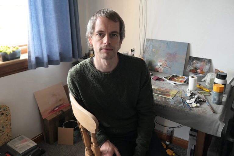
Greg Rook: Artist of the Month
Artist of the Month October 2023:
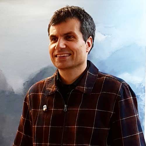
Greg Rook, selected and interviewed by Paul Newman for CBP.
Greg Rook’s paintings explore the rich visual history, curious cultural politics and often complex ideologies of those who seek to start a new life or wish to lead alternative lifestyles. From pioneers travelling to new continents to those wanting to stay put and live self-sufficiently, Rook invites us to join him on his own aesthetic and critical journey through a world of colonies, communities, communes and cults…
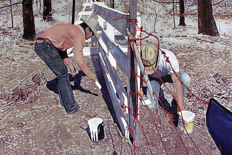
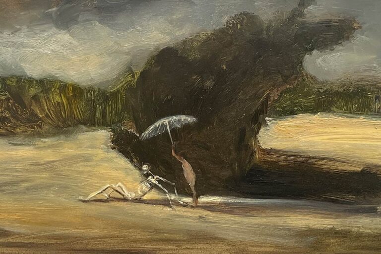
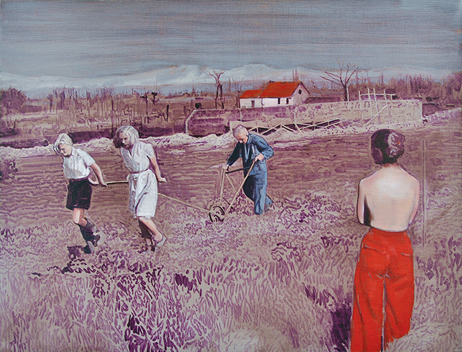
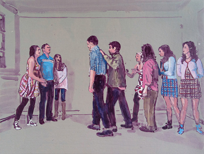
CBP: You are well known for a series of works depicting what appear to harvesters and gatherers. They suggest a reference to C19th Realism paintings of Millet of workers on the land, combined with something of Magic Realism, imbued in the spectral dreamlike ambience of your paintings, as well the incongruous nude figures that interrupt the mundane narrative of the land workers. There is a suggestion of a rural American location. Can you introduce the source material for your paintings?
GR: For the series you mention I was researching commune and off-grid movements, and was particularly drawn to the imagery and intentions of English Georgic landscapes, seventies US communes and Soviet social realism. I was brought up understanding the sitcom ‘The Good Life’ to be some kind of ideal (affable, well-intentioned making-do and self-reliance) and these all seemed like curious distortions of those principles. As with my earlier cowboy paintings, it was important that there was some remove between me and the imagery. I wanted the naivety in my romanticising to be evident – the more I idealised an agrarian, self-sufficient lifestyle, the more it seemed likely to come about through disaster and collapse, not through progressive thinking. This was all long before Trump and Brexit and Covid.
I spent months searching through films, online image archives and backwoods/survivalist books and magazines, looking for the right figures and landscapes. I wanted to reference past painting and contemporary cinema, “serious” prepper literature and recent fiction. I sorted and refined until I had a body of images to work with and then set about creating collages in Photoshop. For this series I would have produced over a hundred from which I eventually painted a dozen. In painting those few I tried to harmonise the different sources and yet let it remain evident that these were collaged from paintings, photographs, film stills and drawings.
CBP: There are different tonalities within these paintings; mediative ambience, something reflective and resilient of the workers and something of muted violence. Perhaps there is a combination of documentary, the stoicism of American Gothic the painting by Grant Wood and American Gothic horror cinema like The Texas Chainsaw Massacre. Are these mixed references and tonalities something you are exploring in your work?
GR: It is and it comes from the diversity of sources. The Wordsworthian, pastoral English landscapes are romantic and describe worthy labour – the benefits of rural over urban. Then there is something more ominous, especially after Waco, Jonestown, the Unabomber and cabin horror cinema, about communes in the Americas. Even the more Woodstockian feel to some of the imagery seems compromised by some Hollywood depictions of US counterculture. And then the Soviet Social realist images lend a mock, and mocking, heroism. The fact that these were sourced and collaged was important, not only to acknowledge my naivety, but also that of the proponents of these past potential futures.
As paintings, of course, I also wanted to nod to their collaged origin. I appreciated the clear collage of Dexter Dalwood and the odd scaling of Neo Rauch. The choices made in how to render areas were partly inspired by the variety of the source material I was referring to. The different types of colour, light and aesthetic properties due to print quality, recording quality or the deterioration of certain forms of media over time and through reproduction, were synthesised in the paintings. As noted by Matt Price, the “practice is bound up with the history of media, of audio-visual culture and technology… of recent history, of its recording and documentation, and, in the process, of modernity itself. For those born before the explosion in digital technology of the 1990s, the visual culture of the analogue world is now something that evokes curiosity as well as nostalgia – VHS, 16mm, Super 8, old offset printing presses and so forth each tell us about the nature of the world at the moment they were the latest technologies. Every generation looks at the people of the past through the visual culture that was current to that time.”
CBP: The gaze of your subjects is often averted, they are quietly absorbed in their work, heightening the ambiguities of interpretation. Are you selecting and depicting the subject viewpoints with this regard?
GR: I had been looking a lot at Jeff Wall, and he talks about Michael Fried’s distinction between absorption and theatricality in late 18C painting: he talks about the different relationships between figures in pictures and their spectators. Fried identifies an absorptive mode, exemplified by painters like Chardin, in which figures are immersed in their own world and activities and display no awareness of the construct of the picture and the necessary presence of the viewer, and the theatrical mode which was just the opposite. In absorptive pictures we are looking at figures who appear not to be acting out their world only being in it.
To some extent there is a parallel here with photography and film. In their typical context the cinema is generally more theatrical and photography usually more absorptive. In exploiting a cinematic sensibility and sourcing from photography, I had, in past works, tried to cultivate an unsettling detachment, as the paintings oscillated between absorption and theatricality, but in this series, I found myself drawn more to the absorptive mode – I wanted the figures to ignore me… to allow me to just document them.
From the series And this, too, shall pass away, completed in 2009, I had begun to see the paintings as if depictions of events with me in the role of documentarian. And this, too, shall pass away comprised of fourteen paintings, inspired by the stations of the cross and, perhaps, Cormac McCarthy’s ‘The Road’. As a new father I was to exploring my fear and inadequacy in the face of potential hardship by moving the viewer round the paintings like a ‘camera eye’ around the transgressive beauty in the centre… moving around as if with a hand held camera – the first person perspective used to heighten suspense and the meditative arena of the stations as a frightening short film. As I was always hiding from the figures, they would never be looking at me.
CBP: The light and evocation of heat in your work is very distinctive, can you talk about achieving these affects in your painting process?
GR: I began using the clear primed linen as a ground, loosely drawing the image from this surface – allowing the ground to do a lot of work. This enabled me to create an almost sun-bleached look – I love the over exposed areas and contrast in William Henry Fox Talbot’s photographs. It seemed also to mirror the bleached light in the documentary sources of a lot of the commune and wartime photographs I was looking at.
After a while I worried about an overreliance on this earthy linen ground, and the difficulty it presented when altering and repainting, so I started to oil prime the canvas to give a slippery and changeable surface. I still painted as if drawing, again thinking about Talbot’s contrast, or Whilhelm Sasnal’s, but when the painting became static I was able to whitewash, or greywash, and draw loosely again. This also led to overexposure and a sense of light-burning heat.
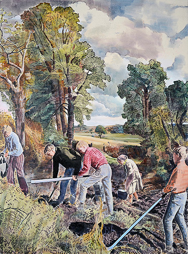
CBP: Your gesture and paint handling is very concise in terms a range of mark making that suggest influence of image manipulation technologies to painting histories – Cornfield alludes to Romantic landscape era painting, like Constable. Land Grab is striking with its contrasting visual and physical textures. Can you talk about this versatility in your mark making? Are you quoting painting histories?
GR: In previous series I’d made deliberate attempts to quote from painters I was interested in. I tried elements of Sasnal, Rauch, Braque, Guston and others. I looked a lot at Van Gogh’s drawings and Gauguin’s brushmarks, and later the beautiful simplicity of Tal R’s Hare Hill pieces. There is something I find really appealing about painting as if drawing – using the brush like a dip pen, and colouring in the flat areas.
I was also thinking about Laura Owens’s approach – in discussing her earlier work she talks about assessing each separate area in a painting and thinking about what an interesting and effective way might be of laying down the paint. This led to syringes and masking and pooling.
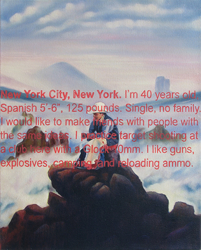
CBP: Can you talk about the text-based paintings: Las Vegas, Nevada and New York City, New York they look they are based on screenshots. New York City, New York echoes the work of Richard Prince. Is he an influence for your Americana styled works?
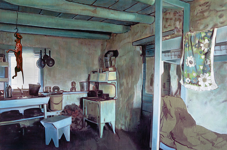
GR: I was very interested in Richard Prince’s work, and the joke paintings were probably what led me to introduce text into previous work. The cowboy element confuses me a little now, but I was thinking less about advertising and more about the enduring myth of the cowboy, thrown out of civilisation and into the wilderness where he was forced to abandon old dependencies and recreate himself from scratch. In the paintings of fence building, rustic interiors, lonely exteriors and quasi-religious tableaux of sacrifice, the cowboys were hard at work marking out a territory. I suppose they functioned as a metaphor for my attempts to build and delineate my own creative and philosophical territory in a world where the old maps didn’t work anymore.
The image in New York City, New York is taken, with cowboy added, from Caspar David Friedrich’s Wanderer Above the Sea of Fog. This allegorical landscape is overlaid with an absurd classified lonely-hearts ad from a survivalist magazine.
In the early 2000s I had been looking at survivalism in its modern context – not in terms of white supremacism or American anti-government militia, but in terms of families choosing to disengage with contemporary society and its aspirations and act ‘as if’, culture-crafting and storytelling – anticipating an imminent collapse of society and constructing their lives ‘off grid’ according to this premonition. There is a link between this survivalist culture-crafting and Levi-Strauss’s idea of ‘bricolage’, and with situational nomadic thinking. These families and individuals value the ability to move quickly and adapt to new situations and environments – their thinking is ‘outside’ thinking. I was struck by the incongruity of this positive take on these communities, sitting alongside the misogynist, racist and frightening tone of most of the classifies ads in the magazines that catered to them.
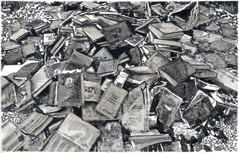
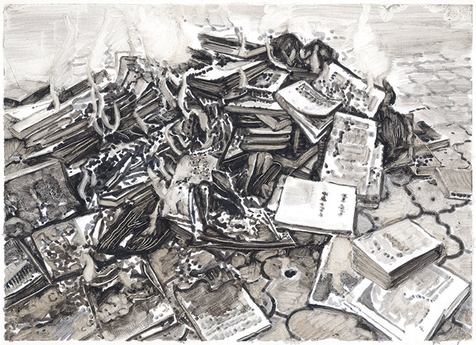
CBP: The burning book trilogy echo a holocaust subject matter and monochrome palette of Luc Tuymans who painted this subject. Can you talk about this series?
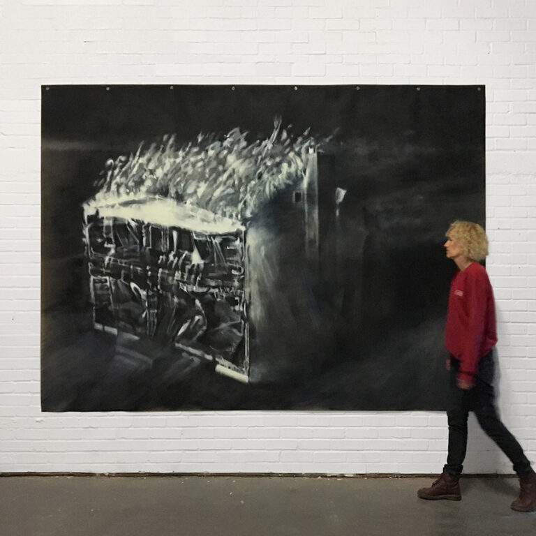
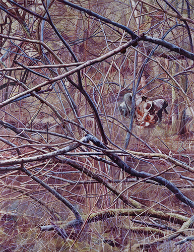
GR: These were part of a series of painting for a show in in 2016. The central motif was the large pile of burnt books, evocative of scenes from fiction such as Ray Bradbury’s Fahrenheit 451 and real-life book burning thorough out history – politicians in the US are again discussing the burning of books. The act is an aggressive desire to eradicate the existence and ideology of another group and rendered in Payne’s Grey and Umber, this graphic series was trying to capture places where people are forced to hide, and woods into which people are forced to flee. As a thought and feeling experiment, they were a little bleak, but as paintings I enjoyed the shapes, edges and textures of the burning pages.
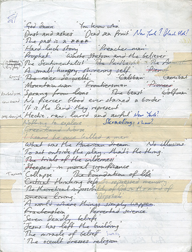
CBP: You’ve included a document of handwritten list in your set of images for this article as a point of discussion. How do you construct or select titles for your work?
GR: I think this was included almost as a self-criticism. A reminder to myself to now think less about titles and subject matter (the possible future titles here are all from my concurrent reading) and more about the paintings as paintings. I have given far too much time to the ideas behind the work which, though enjoyable and fascinating to me, were ultimately a distraction from the painting.
CBP: You are also an art adviser focusing on collecting and placing international, modern and contemporary fine art. In your own words ‘There is a long tradition of artists working as art advisors, poachers turned gamekeepers, and I think we make very good advisors, but celebrating the impact on my practice is more difficult – it’s both inspiring and overwhelming, keeps me absolutely contemporary in my knowledge of the art world but highlights my place in it.’ Returning back to your ‘Americana’ styled paintings, the land workers could be the poachers probing and searching with both hope and futility. Can you talk a little more of how this career has affected the development of your painting and its ideas as well as reflecting back on your previous work?
GR: I now spend most of my time looking at the work of others. I’m fortunate as an art advisor in that I don’t spend my time having to hunt for work that will fit someone’s brief, but instead just send the great group of collectors I work with art that I currently find engaging, critical and progressive. I might send out work from the current Gagosian show, or from a new graduate, or from an artist who I think has been overlooked for years. As a result, I believe I spend my time looking at the best work (I admit predominantly painting) that is currently available. This is inspiring and has me itching to get into the studio, but it is also sobering in reflecting on what I can achieve.
But, if the Americana paintings were pained paeans to the wilderness, and a desperate attempt to carve out new territory, I do feel much lighter now. The task of creating paintings that are worth making because they’re essentially worth looking at, feels just as significant, but less daunting, as now it rests more on the surface, more on the marks and palette, and less on a hard fought and constructed narrative behind it. The task is still endless but feels more direct.
Execution of Emperor Maximilian (after Manet), oil on panel, 30cm x 40cm, 2010 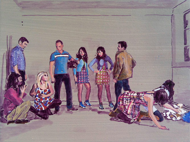
Napoleon at the Battle of Eylau – after Gros, oil on panel, 30cm x 40cm, 2010
Greg Rook is an artist working in London and Surrey. He graduated with a BA from Chelsea School of Art in 2000, before completing an MA in Fine Art at Goldsmiths College, University of London, in 2002.
Since then he has held over a dozen solo exhibitions and featured in more than forty group exhibitions in Britain and internationally. Greg also works as an art advisor building collections of contemporary art for clients.