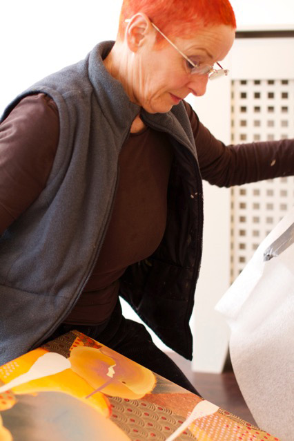
Pen Dalton: Artist of the Month
Artist of the Month June 2020: Pen Dalton, selected and interviewed by Paul Newman.
CBP: There is an exquisite poise in your painting, between an immaculate sense of design, meticulous production methods and a looser fluidity of paint and spontaneity. An abstract painter like Tomma Abts can look meticulously designed at first glance and in reproduction, then more of the unpredictable nature and uncertainty of painting reveals itself on closer inspection. Yours reveal both of those qualities apparently and in equal at the same time. Could you discuss the balance of these aspects in the making of your work?
Pen Dalton: I don’t often begin a work with any conscious intention to create a binary effect, though in retrospect – and you’ve picked up on this – I’ve become aware that opposing qualities are often seeking some sort of reconciliation or balance on the canvas. I prefer the word reconciliation which has an ethical, dialogic dimension; it recognises differences and contradictions but each element or motif is given their due regardless of questions of taste, symmetry or any necessity for binary balance. So the paintings are often an attempt to reconcile many different elements on the same canvas in an aesthetically pleasing whole. Not ‘abstract’ at all.
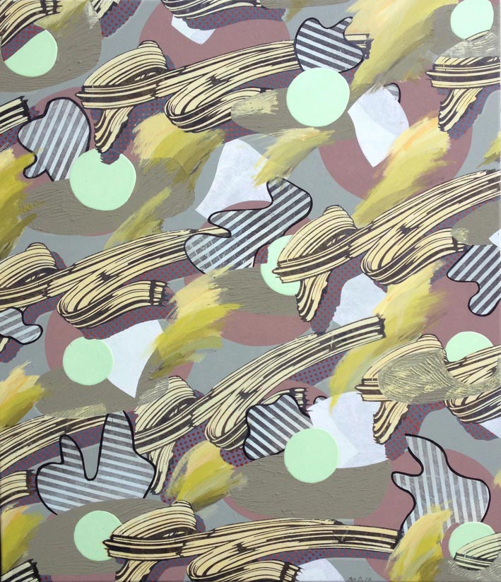
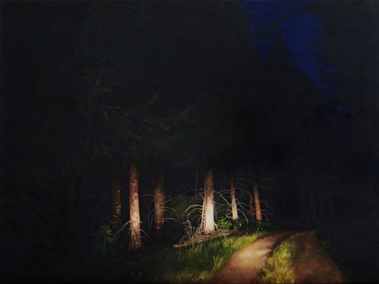
In this painting for instance (fig.1) – produced as a technical exercise to help develop my painting skills – I combined heterogeneous brushstrokes copied from other artists, from different cultures, historical epochs, genres and identities. As is usual with my process the title and meaning only suggest themselves in later stages or after I’ve completed the work. The pastiche of different brushstrokes immediately suggested the title Different Strokes – [for different folks]. This kind of all over patterned painting in my repertoire has become analogue for difference itself – with regard to class, gender and generation, ethnicity and race. It deals with the problem of how many elements can live together in an aesthetically and ethically satisfying whole.
CBP: Do you build up your painting up from drawings or studies, adding complexity? Is there much correction, erasure, covering over complete compositions underneath?
PD: I don’t do any preparatory work in the sense you describe. I think about the next painting I’m doing in a vague sort of way when I am doing other things – in the shower, cooking or washing up! Quite a lot of time is spent mixing colours of the right consistency, opacity, flow and shine as well as preparing smooth grounds which I like to do in contemplative manner, getting a feel for the surface and the scale before I begin. This preparatory time is often longer than the execution of the painting itself.
I begin with a ‘statement’ of some kind, a precise shape, a tone or a brushstroke on the canvas – it doesn’t usually matter. I try to respond intuitively to the first mark [intuition, or ‘feel’ I believe is a kind of emotional ‘body knowledge’]. Another element is added to contradict the first statement – so the paintings often have a dialogic dynamic that builds up, each layer taking part; enhancing, amending, concealing or denying until the whole feels ‘right’. Analogue practices are always in play: I think of paint as forgiving – any statement I make can be retracted, altered, emphasised or withdrawn. I can paint over the cracks, cover things up or I can highlight and dramatise just as one does in dialogue with an other.
CBP: Your colour schemes are exotic, occasionally toxic, in synch with the contrasting the range of mark making and textures. It fits with your acrylic medium and can have a particular synthetic quality. What influences your use of colour?
PD: There’s quite a few considerations at work here. My modernist art education in colour theory taught me to consider not colour on its own but always attached to some texture/shape/scale or viscosity. All colours carry historical meanings and associations – classed, gendered, historical and cultural – that can be deployed in paintings and understood at a semiotic level.
The colour combinations and exotic textures that you mention arise from my experimenting with things I see around me: faux diamonds, gold and glitter catch my eye in Asian and African fabric shops in the market where I live in Walthamstow. They have a reflective joy, life and energy. Highly pigmented colours, shine and glitter have associations with the primitive and childlike, with feminine bad taste, the glitzy panache of burlesque, drag and working class Essex Girl flaunting. In Venice on holiday, I saw the bling in Renaissance artworks and a study of Rococo painting soon put those class based cultural prejudices in their political place. I regard the introduction of such ‘meretricious’ materials as a somewhat aggressive assertion – a ‘toxic’ thrust – against the washed out good taste of so many English cultural critics of painting.
CBP: There is a strong sense of design in your painting that alludes to fabric design, wall paper motifs and print making, along with quotations from other painting. You contrast flat patterns, illusionary 3D shapes and heavy texture. And it feels the diagonal is important too. What are some of the influences and inspirations for your imagery?
PD: My father had been a printer in the London newspaper industry. I learned to print as a young child with the newsprint, lead letters and oil based black ink he bought home from the foundry. It is only in recent years that I have been painting. So for me, pattern, repetition and printing – especially black and white printing – are associated with production and reproduction of the father figure.
At Dartington College of Arts in the 1980s I ran the printmaking department and was able to combine printed text and image, relief and screenprinting, the commercial and aesthetic in posters, fabrics, wallpaper, scratch magazines in a spirit of Bauhaus eclecticism; most printmaking departments in art schools at the time were working in the tradition of the limited edition.
There are lively psychological explanations of why people like pattern and I guess theres something obsessive going on. But I also think of painting this way as akin to dancing or strong rhythmic music. I sometimes dance in the studio as I listen to Ska or the repetitious music of Philip Glass.
Yes the patterns do have a strong diagonal which I sometimes have to resist – Its something thats always appeared in my work and involves body movements from lower left to upper right akin to handwriting.
The fact that that the paintings have been compared to decoration, to wallpaper or fabric – feminine, not usually considered ‘art’ – appeals to me. I don’t consider whether or not my painting is art, that’s for critics to decide.
CBP: Is there an optimum scale that works best for you, in terms the size of figuration and motif in relation to the support?
PD: I have always worked medium to large scale and if possible, in a large empty studio space. When I joined CBP, so many shows asked for small works so I reduced the size quite dramatically. Gestural elements were inhibited and more static ‘motifs’ took their place. Working small scale feels very different. Bodily rhythmic exertion was transposed to a much more concentrated process that involved just the hand and eye and negated the body in a seated/static position. There was also much less risk if things went drastically wrong. I was able to produce many more small artworks that were less expensive, easier to sell, easier to transport and store. I have been doing small scale works for the last few years and I find it useful for technical experimentation.
But when doing large painting I respond more intuitively to the nature of paint as it appertains to the body and the semiotic function. I like paint to ‘have its say’ – and to respond to its often uncontrollable tendency to dribble, wrinkle and bleed. I respond to its smells, textures, fluids, and visceral associations. Although I enjoy and explore the purely visual delights of digital imagery I veer towards portrait orientation as analogous to the body that in scale and proportion as well as surface texture, is as unlike tv monitors and coloured light as possible.
CBP: Can you discuss a couple of examples of the techniques or tools you use in your painting?
PD: Many of my paintings have some sort of halftone pattern applied to the surface. As a printing device for representing the problem of ‘grey areas’, halftones can suggest vast possibilities that lie between polar opposites, between black ink and white ground, between the metonymics of black and white skin.
I make some of these halftones using commercially cut stencils that reproduce Rauschenberg-like Ben Day dots.
Other half tones are acquired as downloadable ‘screens’ [regular patterns] from graphic suppliers and Manga drawing apps. These ‘screens’ can be digitally enlarged, projected directly onto a large scale canvases, traced and painted. Or I print them onto transparent film as positives and with light sensitive chemicals, apply them to a silkscreen. My preference is to print out halftones as stripes or dots on thin paper Tengujo which can then be pasted and cut to shape on the canvas. [see Holiday in Valencia]. Here’s an edited extract, from my PhD thesis about the meanings this paper has for me.
“… Tengujo paper is so thin that when printed and adhered to a support such as canvas, it seems to disappear and all that is left is the printed mark. Just as the black printing ink reminded me of the dominant relation of the father, Tengujo paper, as substrate: thin, white and absorbent stood in general terms for what I saw as the daughter’s position in the Oedipal family; as the youngest little girl minor, overlooked, insignificant. As I worked with Tengujo paper, other reasons why it appealed to me became apparent. It reminded me of the sheets of white skin I carefully peeled off my sunburned shoulders after days on the beach as a child. Like the skin of a young girl Tengujo is delicately transparent when wet and slightly veined, it has no grain only a skin like pattern resembling pores and tiny creases. But it is surprisingly strong and perversely challenging in its behaviour. The assistant in the paper shop where I bought it didn’t like handling it because it caught in every light draught, would not lie flat and smooth in the plan chest drawers. It is elusive, difficult to control and won’t lie down on the printing bed but slides out sideways at the slightest air pressure when the screen is lowered. It has to be respected. It is extremely hard to tear but very easy to cut. Tengujo I discovered is a paper used extensively in library archives to repair valuable old prints, books and manuscripts: to preserve the past and leave no trace of itself on the surface….”
All the materials and techniques used in painting – the brushes, the grounds, the varnishes and mediums could be deconstructed in this way. Each one has historic and recursive meanings that when combined, create new meanings that are available to be understood or simply felt in the encounter with the work.